I’d Plus One That! Why I Think Google’s Shared Endorsements Are a Good Thing for Social Media, Influencers and Consumers

Are You On Google+ Yet?  If You're Not You Should Be

There’s been a lot of talk today online about the upcoming change in Google’s TOS that will allow them to begin selling ads with your endorsement of various products and services on the web. I’ve seen different reactions from some people who dislike this idea and others who are largely apathetic about it.

Because Google gives everyone an opportunity to opt out of shared endorsements, it’s easy to dismiss a lot of the criticism by simply pointing folks to how easy opting out is. Some people are very anti-advertising though and certainly this new advertising channel will naturally be met by some with healthy skepticism. It’s also worth noting that these ads are not going to appear on Google+. Google+ will remain ad free. The new ads simply will use Google+ data to advertise in places where Google is already advertising, like search.

Personally speaking, for myself, I embrace change. In general I’d rather see more change, than less. I think change represents innovation (usually) and I probably tend to look for the positive in change rather than the negative. I’m a glass half full sort of guy when it comes to change.

I think most of us see how today’s announced change in the TOS is good for businesses who advertise. Personal endorsements by our friends are incredibly powerful motivators. Ads which feature personal endorsements by people we know, trust and respect, will be far more effective than other ads that an advertiser might come up with.

I think we can also see where this new product would be good for Google. Google gets paid by the click. If they can run ads that produce way more clicks and are more effective, it would seem to stand that they can make more money selling ads. The more clickable an ad the more revenue per page view it represents.

The last part of this equation though is the user, and I think a lot of people are trying to figure out if this is a good, bad, or indifferent thing for the user.

My opinion is that this is a good thing for the user and here’s why.

1. I believe that this change will push brands, products, services, businesses, etc. to allocate more of their marketing budgets towards social media and social media influencers than in the past. It’s ridiculous to me how much money companies like Canon and Nikon and other old brands, that just don’t get it, spend on things like tired old photography magazines and traditional print media vs. social media.

Social media is the future. By increasing the value of our possible endorsements through advertising buys, companies will spend more time, effort and money to court social influencers.

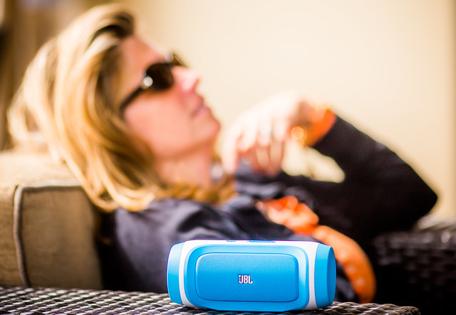
My favorite lens is the Canon 135 f/2. I love that lens so much. By allowing Canon the opportunity to buy that love in the form of a Google ad and promote it, that gives Canon a more powerful incentive to work with me to be more public about my love for this lens. I love lots of other things too. I’m not shy about telling folks when I like something. I had dinner last night at A 16 in Oakland, and it rocked. I like to spread the good word.

I predict that individuals with large followings on G+ will increasingly be seen as potential partners for brands whose products they use. If you consider yourself a social media type, this will be one more important reason why you’ll want to devote time to building out your presence on G+.

There will be a risk of course that some influencers will be bought off by brands for positive endorsements, but I think most of the time this stuff is pretty easy to sniff out. It’s the true, authentic, natural posts (available for purchase after the fact as ads) that will be most valuable. I bet brands spend more time showing us their cool new tech and products as the value of these ads become apparent and more of their budgets are spent on promoting products to G+ users.

2. When a company buys an ad with your endorsement, this is one more place that your social media footprint is shared on the web. I’m not sure if the endorsements will actually link back to your profile or the actual product review itself, but as I’ve seen it, it will at least include your name and your avatar.

One of the reasons why I never change my avatar is that I believe having a strong avatar that is consistent over the years with your brand helps you build recognition. When I see Robert Scoble’s avatar, I immediately know that it is him — I’m biased of course because I took the photo Robert uses for his avatar. 🙂

Even faster than I can read Robert’s name, I know it’s him.

When Facebook first started showing brands that your friends liked, Robert jumped right on that bandwagon. For about 2 months every time I logged into Facebook, I was seeing another brand that Robert liked. Were the brands paying Facebook for that? Probably. But it also constantly reminded me of a good friend and also linked back to him in the like. I have to admit that I ended up liking a lot of the same brands Robert did, when it was something I really liked.

3. Knowing that one of my friend’s has endorsed a product helps *me* make buying decisions. Let’s say I’m in the market to buy a new filter for my camera. Wouldn’t it be a positive for me to know that another photographer I respect (like Joe Azure) seems to like his Lee Big Stop Filter? Isn’t that a lot better than just a generic ad? Especially if I see a lot of my friends endorsing one product, this may be a good signal to me that this product is worth checking out more than others.

I saw a report earlier today that said that by 2014 10-15% of online reviews will be fakes. With all the fake reviews and astroturfing out there, I’m more inclined to trust the word of a friend on a product or service, than a stranger.

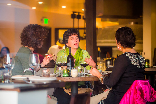
This is why I don’t really use yelp anymore. Every time I go to yelp I wonder if the review I’m reading is legit or whether or not someone from India or China has been paid to write it up and give it a five star rating. When I was recently in New York City, rather than rely on a service like Yelp to figure out where to eat, I instead relied on my good friend Daniel Krieger, whose opinion I respect and know I can trust. Would a five star dinner recommendation for a new restaurant in the form of a Daniel Krieger advert get my attention? You bet it would. As a consumer, this is a win for me.

Certainly there may be things that go wrong with the implementation of all of this. What if I’m not really endorsing something but my endorsement is slapped on it? Some of this will likely have to be worked though. As far as the general idea of shared endorsement goes though, I think I like it.

Oh, and by the way, if you were wondering whether or not those sea salt and vinegar chips in the dark blue bag by Kettle Chips were the BEST CHIPS IN THE ENTIRE WORLD? Yep, they pretty much are — and if Kettle Chips wants to send a few bags of those over to our place, my daughters and I would totally be down with that. 😉

A 16, A Southern Italian Gem in Rockridge, Oakland

Tonight, along with mrsth, I finally decided to check out one of the highly regarded Oakland restaurant newcomers, A 16, in the Rockridge District of Oakland.

A 16 has been open for about 5 months now and is a sister restaurant to the popular restaurant with the same name in San Francisco’s Marina district. The restaurant took over the old Hudsons/Garibaldi’s space on College Avenue. Like their Marina counterpart, the restaurant focuses on Southern Italian Campania region food. A 16 is a highway in Italy that runs from Naples in Campania to Canosa in Puglia.

Unlike their Marina relative, A 16 Rockridge has a liquor license allowing it a full bar and cocktail service to go along with their menu.

Chef Rocky Maselli has put together a wonderful menu that focuses on pasta and gourmet pizzas, with lots of little extras worth exploring on the menu. Everything we had tonight was absolutely first rate. No dish disappointed. The fresh handmade pasta was the highlight.

Before beginning our meal we started out with two cocktails from A 16’s creative cocktail menu. I had the Hemingway Negroni, which was served over a couple of giant ice cubes in an attractive oversized tumbler. It was made with papa pilar rum and was delicious.

After cocktails we ordered the roasted beets and heirloom tomato salad. The salad was complemented with ricotta and generously dressed with olive oil. The beets, tomatoes and cheese, went well together and it was a refreshing end of a Bay Area summer salad.

After we finished the salad, our main dishes arrived. For our main dishes we decided to share the capunti — pancetta, chanterelles, cherry tomato, smoked caciocavallo pasta and the montanara rockridge pizza.

All three of these dishes tonight were recommendations of the very knowledgeable bartenders who took care of us at the bar. Mrsth and I always prefer sitting at the bar over a table and find that the bartenders frequently are the most knowledgable of a restaurant’s service staff. Tonight, especially, they did not disappoint.

The capunti pasta was my favorite dish of the evening. The taste of the caciocavallo cheese in the pasta gave it a wonderful smokey taste. It was a rich, full flavored rewarding dish. The montanara pizza, named for the local neighborhood, was also splendid. We added prosciutto and arugula to the burrata (again at the bartender’s recommendation) on the pizza and it complemented it perfectly as did the Scrimshaw Pilsner I ordered with it.

Finally for dessert we decided on the fried apple turnovers which came alongside a rich caramel honey type sauce. Before serving us our turnovers, the staff brought us over a complementary plate of Italian cookies to enjoy. The three turnovers were the perfect amount of sweet to end our evening.

We didn’t have any wine with our meal, choosing to stick to more cocktails and a beer with the pizza. The restaurant does have a wonderfully full wine list though. You can also bring your own bottle (with corkage charge). The menu said that they would waive corkage charge per bottle brought with each bottle bought from their list. They offered both tastes and full pours of wines by the glass.

The ambience of the restaurant was very nice. The bar is large and oversized with plenty of room on a large marble slab. The restaurant is open and airy, and once the sun went down and they opened the shades, a rich, warm evening sunset sunlight filled the restaurant.

The service for our meal could not have been better. Two bartenders managed the bar, and even with a full restaurant, were able to give us the highest quality of service. The recommendations of our bartenders were all absolutely spot on. Meals were promptly delivered and dishes quickly removed. They allowed us to sample taste some of the liquors used in the cocktails when deciding on which drinks to order. I usually find that I get better service at the bar, which is one of the reasons why I prefer the bar over a table, and it was especially true tonight.

We were both delighted tonight with our A 16 experience and definitely will be back to this neighborhood gem to try even more dishes. The only downside to tonight was that they didn’t have a television set at the bar and so we had to rely on our cell phones to keep track of the A’s/Tigers American League Divisional Series deciding game. The restaurant also doesn’t have wifi service and cell service in the restaurant was spotty.

Lack of a TV and good cell service, however, are probably a bonus for many. 🙂

Hemingway Negroni, A 16, Oakland

A 16, College Ave in Oakland's Rockridge District
A 16, College Ave in Oakland’s Rockridge District

MMMMM... Beets and Heirloom Tomato Salad
MMMMM… Beets and Heirloom Tomato Salad

Cocktail #2, A 16, Oakland

Fresh Handmade Pasta, A 16, Oakland

Dinner at the Bar, A 16 Oakland

Fried Apple Turnovers with Caramel Sauce, A 16 Oakland

A Little Prosciutto and Arugula to Complement the Pizza, A 16, Oakland

Cooking Pizzas in the Open Kitchen of A 16, Oakland

A 16, Oakland
A 16, Oakland

Fresh Cocktail Ingredients, A 16 Oakland

Cookie Time, A 16 Oakland

Cocktail Menu, A 16 Oakland

Google+ Releases Advanced New Photo Editing Tools

All At Once Her Heart Opened Up

Today Google+ released a whole new enhanced online photo editing suite of tools. I’ve been playing around with them for the past few hours and am impressed with what you can do with them as an online editor. While they won’t replace my more traditional desktop tools (i.e. Lightroom, Photoshop, Nik, FX Photo Studio Pro, etc.), I think a lot of more casual users will love them.

The online editor does a lot of the basics of editing (contrast, brightness, shadows, cropping, sharpening, structure etc.), but it also comes with some pretty slick vintage and what they call retrolux editing. These new tools allow you to customize your photos in a lot of the more popular faux photo styles currently hip with the Instagram crowd. While G+ offers some quick filters, they also give you more granular control over how much of each sort of effect you want.

The new editor also includes spot editing tools, which allow you to adjust only parts of a photo that need it and some interesting spot focusing tools, including tilt shift editing.

I edited the photo at the top of this post using the new G+ tools. It’s great to see Google continue to invest and innovate in the online photo sharing space. Below are some screen shots of some of the tools in action.

You can find more information about the new tools here and in the embedded post at the bottom of this post.

Google+ New Retrolux Editing

Google+ Structure and Sharpening Editing

Google+ Vintage Filters

Google+ Cropping Tools


2,500 Kick Ass Photographers on Google+

2,500 Kick Ass Photographers on Google+

Over the past 2 years I have been super active on Google+. Google+ has emerged as the best community on the web for photographers. Photos look great there, but photos look great a lot of places on the web today. More significantly, Google+ is a positive, visually oriented community where photographers can meet, talk, get to know each other and develop and maintain friendships.

I’ve met more photography friends on Google+, than any other social network.

As I’ve gotten involved with Google+ I’ve shared my circles of photographers. When Google+ first started out and I built my photographers circle up to 500, I shared it, then 1,000, then 1,500, then 2,000. Last week my photographers circle on Google+ hit 2,500 and I shared it again.

If you want to see some of the best photography being published on the web today, check out some of these photographers.

Part 1-5 (A-Da)
Part 2-5 (Da-Ho)
Part 3-5 (Ho-Mi)
Part 4-5 (Mi-Sh)
Part 5-5 (Sh-Z)

The New SmugMug, Awesomize Your Photo Sales on the Web

My Home Page on the New SmugMug

SmugMug, widely regarded as one of the best internet sites on the web for amateurs and pros alike to share, and especially sell, their photos, unveiled an entirely new SmugMug this morning.

I’ve had early access to the new site redesign and have been playing around with it for the past few weeks — I’m a huge fan.

The new SmugMug brings fresh, updated, design and functionality to the service and is probably the most significant upgrade to the service since it started.

Most significantly, the new SmugMug brings a new line up of beautifully designed templates that allow even the most basic internet user the ability to have a photo commerce site up within minutes.

As much as I enjoyed the old SmugMug as a place to sell my prints, one of the negatives of the old site was that it could be complex and complicated to get a attractive looking interface up. The old SmugMug offered the ultimate in customization, but many photographers are not web design experts and it could be challenging to do it yourself. While you could hire outside pros to customize your site, this added a layer of cost and complication to the equation.

While the new SmugMug still allows advanced users an incredible amount of customization, they also now offer a series of basic templates that are pretty much plug and play. The new templates are stunning right out of the box and you can easily use a new series of tools to do minor edits to add in basic elements that you want to use to present your photos uniquely.

These new templates have been optimized to look good on the three basic interfaces, web, tablet and mobile. They have also added custom links that can be added to your blog, Facebook, Google+ and Twitter as part of any design interface.

In addition to the new design choices, SmugMug also rolled out today a new photo organizer that allows some of the most advanced functionality in photo sharing today.

When Flickr redesigned their site earlier this year, some users were disappointed that Collections lost visibility on the site. The primary way that Flickr manages photos is with sets. Sets can be one dimensional though. Sometimes you need sets of sets. Sometimes you even need sets of sets of sets. The new SmugMug allows seven layers of photo organization.

So if you want to have a page of American photos organized by states you can do that. If you want to be able to drill down into each state and look at the various cities, you can do that too. If you want to drill down even further and look at the various neighborhoods in each of the cities, you can do that.

More control over hierarchy was the number one feature request that SmugMug users had asked for in their user forums.

The new SmugMug organizer also offers lots of ways to bulk edit your photos, allowing you to batch add keywords, delete files, apply custom captions, etc.

Personally, I do 99% of my metadata work at the file level in Lightroom, but here is where SmugMug offers me one of my favorite features, Smart Galleries. Smart Galleries are not something new with this release, but Smart Galleries allow you to build highly customized automated galleries based on keywords. If I want to build an album of all of my photos of abandoned buildings in Detroit, I can do this simply by building a set that includes any of my photos keyworded with abandoned AND detroit. Now anytime I upload any new photos to the site that have these keywords, they will automatically be added to that album.

Creating a Smart Gallery on the New SmugMug

My Abandoned Detroit Set on the New SmugMug

One of the problems with redesigning photo sharing sites is it doesn’t matter how good a job you do at it, there will always be naysayers from the “who moved my cheese” crowd who will moan about it. It doesn’t matter how much better you make something, some people just love to complain. Haters gonna hate, gators gonna gate, tators gonna tate, all that stuff. One of the smart things that SmugMug did with this redesign is that they gave control over the new site to the user. If you are already a SmugMug user and *don’t* want to opt into the new site design, you don’t have to.

From SmugMug:

“Unlike many other services, we’re not forcing you to ditch your existing site. You’ll have your very own secret preview mode that contains all your galleries, so that you can personalize it and get familiar with the new features. While it sounds scary, migration simply copies your website contents into a virtual sandbox that only you can see. When you’re ready, YOU unveil your changes and make it public.”

I’m sure that there will *still* be some who complain, even though they get their *choice* over new or old SmugMug, but this should go a long way towards the inevitable backlash that comes with every redesign.

Also, the pricing is staying the same for the service and they are even adding unlimited video uploading to all levels of account with no price increase. At present SmugMug’s pricing remains: Basic: $5/month or $40/year, Power: $8/month or $60/year, Portfolio: $20/month or $150/year, Business: $35/month or $300/year.

Buying a Print on the New SmugMug

If you are a photographer who has thought about selling your photos on the web, but has held back, now is the time to jump in. With the new SmugMug today, you can easily have a professional looking photo commerce site up and running within minutes. SmugMug offers a generous 85% payout on all sales and gives you a great place to send people to who want to buy your prints.

I’ll be on a special episode of the Trey Ratcliff show tonight where we’ll talk about the new SmugMug — 7pm PST.

There is a live vidcast of the new designs with SmugMug CEO Don MacAskill at 10:30am PST today here.

If you want to check me out on my SmugMug, you can find me here. I’m in the process of adding several thousand new photos to my SmugMug. Feel free to buy a print if you’d like. 🙂

More from SmugMug on the new design here.

Two new videos about the new SmugMug here and here.

More from David Pogue at the New York Times here.

Trey Ratcliff: Top Five Features of the New SmugMug

Yahoo and Flickr Renege on Their Paid Advertising Free Accounts

The New Yahoo Advertising Tool Bar on Flickr is Ugly

One of the things that I’ve liked about being able to pay Yahoo and Flickr $24.95 per year, is that it comes with an advertising free experience. The deal between Yahoo and Pro accounts is simple, and can be summed up in Flickr’s own words: “No ads in your browsing experience.”

While new Flickr Pro accounts are no longer available, all existing Pro accounts were given an opportunity to grandfather in their Pro accounts and continue them ad free. If users want an ad free experience now, they have to pay double the price as the old Pro account, but it’s still an option.

In the past, when paid accounts on Flickr have complained about advertisements, Flickr pointed them to a toolbar that a user likely installed: “If you are pro, we don’t show you ads on Flickr, but you may have unintentionally installed a browser toolbar, extension or add-on that is serving them.”

I’ve always respected Flickr for offering this ad-free option, it’s a refreshing departure from Facebook, where we are bombarded with ads at every turn.

Unfortunately, today Flickr has reneged on their advertising free account by forcing a new Yahoo tool bar on all Flickr users, both those with free ad supported accounts and those of us with paid ad-free versions. It’s an ugly intrusion to an otherwise beautiful new Flickr. It also advertises at me on *every* *single* *page* on Flickr — a bunch of Yahoo services that I *do* *not* *want.*

Complete with a Yahoo logo, the forced real estate takeover also offers me Home, Mail, News, Sports, Finance, Weather, Games, Groups, Answers, Flickr, omg!, Shine, Movies, Music, TV, Health, Shopping, Auto, Travels, Home.

There is no way to disable this forced tool bar. Worse it follows you as you scroll down the page. It never goes away. As of right now it is impossible to be on any page on Flickr without having these hyperlinked ads in your face.

I think these advertisements are just awful. I think they are distasteful and I think it’s unfortunate that Yahoo is so greedy that they cannot be satisfied with our simply paying them for an ad-free experience. If Yahoo cannot make enough money off of Flickr, then increase the price, or give us an option to pay more and remove this intrusive forced advertising bar.

Flickr is supposed to be an elegant, paid, ad-free, photo experience — or at least one version of it is. Forcing advertisements like this on ad-free accounts is wrong. Flickr should give all paid accounts an option to x out this ugly marketing based tool bar and make it go away.

There are few things as annoying as having a toolbar forced on you with a bunch of advertising links to things that you do not want. You can follow user reaction to this new forced tool bar in the Flickr Help Forum here.

You can and should do better than this Flickr.

Take Your Music With You on the Go With the JBL Charge

JBL Charge-1

Recently I was given a JBL Charge to check out. I’m a fan. The JBL Charge is a small speaker system, about the size of a can of Tecate, that wirelessly hooks up via blue tooth to your tablet, computer or smart phone. Setting the speaker up is easy — you just turn bluetooth on on your phone and push a button on the speaker, and smooth, rich sound comes pouring out.

Last weekend I drove from San Francisco to Los Angeles and back for the Father’s Day weekend and used the Charge driving both ways to listen to music from my phone rather than the car radio. The speaker is louder than the stereo system in my car and the lithium battery built into the Charge lasted for the 10 hour ride down (highway 101) and the 6 hour ride back (highway I5). According to the specs, the battery can last about 12 hours, which is usually going to be enough for an outing. You can also charge your cell phone via USB or other devices using the Charge as a back up battery.

It was nice to be able to listen to my own tunes on my phone rather than the radio while driving. I could adjust the volume of the charge either on the charge itself or on my phone. I just kept the Charge in the center console of the car in one of the cup holders while I drove.

I also used the Charge to play my wife’s favorite playlist while hanging out down at my parent’s pool on Saturday night (that’s her in the photo above). It was great having such a portable music system for us to listen to while we watched the kids swim.

JBL Charge Portable Wireless Bluetooth Speaker (Blue). You can get the charge at Amazon for about $150. It comes in different colors, but I like the light sort of neon blue the best. The charge is small enough that it’s easy to take around with you and it fits conveniently right into one of the lens spots in my camera bag — a great product that will spend many years on the road with me as a travelling companion going forward.