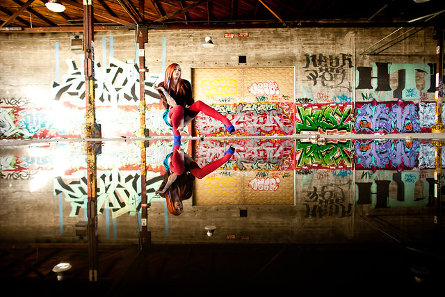
I know you’re not supposed to have a favorite crop, but the square crop is my favorite.
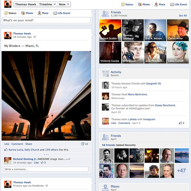
I’m not sure if anybody’s noticed or not, but I think in the past few days Facebook has added a few little redesign elements into our timeline views. Most notably it seems like the “your contacts” that they show you are better positioned. More and more these days I’ve noticed that from a design standpoint facebook seems to be favoring the square crop. I love this.
Look how square all of the photos look on my Timeline screenshot above. I get a big bold photo (square). I get thumbnails of 8 of my friends (I have no idea how Facebook chooses who to show here do you? — but again square). I get avatars of 58 friends I’ve added recently (again square). Square, square, square. Of course Facebook also just bought the most square photo site of all Instagram.
I’m not a designer, but personally I think this page looks GREAT. I can’t believe how far Facebook has come. I remember when I used to bitch at Facebook all of the time because they gave us these microscopic thumbnail sized photos on our pages and that was it — but now we get these gorgeous oversized square photos on our timeline page. We also have a tool to “feature” a photo on Facebook now (just hover over a photo on your timeline and push the star button).
Facebook also now has the absolute best full screen photo view in the business. (click on a photo, click on options when it comes up big, click on enter full screen). From here you can just use your arrow keys to go back and forth through someone’s full screen photos.
Now next Facebook needs to increase the size of the photos in the regular feed. They are still way too small there.
One thing for sure with photos online is that bigger is better. I love that on Google+ the photos keep getting bigger too. The recent redesign there showed us a big bump up in landscape sized photos in our stream. It also came with the introduction of the black bars that people don’t seem to like. I like them for some reason, but I’m weird.
There is one very simple way G+ could improve the photo though and that is to make square photos even BIGGER. If you let a square photo on G+ fill the entire envelope on a post, you’d make the square photo the largest photo of all on G+. This would look great. Look at my Flickr stream here. Notice how the square photos are bigger than the other photos. Smart, smart, smart flickr. Look how much better the square photo looks than the other ones simply because it’s bigger.
Again, bigger is better (just ask Jeff Wall or Richard Serra).
The other thing that I like, besides the square, are photo mosaics. This is my favorite page of my photography that exists on any site, anywhere on the internet. So many photos and with infinite scroll. You know what else is cool? The hover over fave. Hover over any photo on this page and click on that little +1 button (hey thanks for the +1 by the way!) 😉
Flickr’s new justified view is another example of this. Look how cool my favorites on flickr look as a photo mosaic. Flickr also uses this view for the photos from your contacts. Flickr pretty much ripped off Google+’s page design here but that’s ok because Google then ripped off their hover over fave/+1. I love it when photo sharing sites rip each other off and take the best elements of design. Flickr does need to remove the photographer name from their mosaic views though. That looks ugly. They should only show the name if someone hovers over the photo. It looks too much like a watermark the way they are doing it now and we all know how ugly photo watermarks and signatures look on photos. Also Flickr still needs to give us more infinite infinite scroll. Six pages of photos is not enough. Maybe if they bumped it up to 25 pages that might work.
I’d love to see sites do more and more mosaics like this. That’s what I want to see in the future of online photo display — more mosaics and more squares. What about you?