Belotti, Oakland, California

Belotti, 5403 College Avenue, Oakland, CA

Had dinner tonight at the lovely Belotti on College Avenue in Oakland, California — a wonderful Italian restaurant with some of the most amazing dishes. Definitely a memorable meal and definitely a new local favorite. Since we were speaking Italian, brought a nicely cellared 1998 Barolo which accompanied the meal perfectly.

Belotti

Belotti

Sen?or Belotti

Clerico 1998  Ciabot Ginestra Mentin Barolo

Belotti
Hand cut certified Piedmontese ribeye dry aged beef tartare, carasau bread, parmigiano reggiano, micro arugula, aged balsamic, truffle caviar, quail egg yolk.

INSALATA DI BURRATA
INSALATA DI BURRATA — Organic mixed leaves, celery, California nectarines, Italian burrata, crostini, Piedmontese amaretti cookies, 8 years aged balsamic Giuseppe Giusti

Tortino
My favorite dish of the night. Don’t miss this one! Tortino. Organic spinach flan with runny egg yolk center, Grana Padano D.O.P. sauce, sauteed spinach, brown butter, Alba black truffle.

AGNOLOTTI DI LIDIA
AGNOLOTTI DI LIDIA — Traditional Piedmontese style stuffed pasta with beef shank, flat iron, pork loin, sausage, escarole, spinach, parmigiano, beef reduction

BRASATO
Brasato — 5-hour braised flat iron, Italian organic polenta, organic hen of woods mushrooms, nebbiolo reduction

Panna Cota
Panna Cota for dessert.

Note, they also have a bottega on Piedmont Avenue at 4001B Piedmont Ave. Oakland.

Top 10 Ways to Improve Flickr for 2018

Having spent thousands of hours on Flickr over the past 15 years or so, on a personal level I’ve become fairly invested in the site. To date I’ve published over 140,000 of my photographs there. I publish 40 or so new photos there every single day. It’s my primary archive of my photography work on the internet. I’ve also been actively involved in groups over the years which have led to many personal friendships for me. I’ve favorited over 720,000 photos that I’ve browsed over the years. I blog about it. I search it for photos to map as I’m going about my project of documenting America. It’s my favorite site on the internet.

That said there are some significant ways that Flickr can improve and given the new recent ownership change I thought now would be a good time to write about some of the ways Flickr can improve from here. Jef Poskanzer another early Flickr user also made his own excellent to do list for Flickr here.

The power of Flickr in my opinion has always been the community. I think there are ways that Flickr can recapture some of the community spirit that it did have in years past and grow to become the primary community for photographers on the web going forward. This will take work but will be worth it in the end for the community, it’s users and now SmugMug.

Flicker Meetup, 7-7-2005, #3
Flickr Meet Up, Crossroads Cafe, 2005.

1. Community. In the earliest days of Flickr when a new user would join co-founder Caterina Fake would greet them personally on the site and welcome them — not a bot or a script, but Caterina herself. While this would not scale today, I think the original founders of Flickr realized how important community development was in the early success of the site. I remember shortly after I joined Flickr going to some of my first photo meetups in San Francisco at a local coffeehouse. Flickr’s other co-founder Stewart Butterfield would show up and so would Cal Henderson and many of the other early Flickr staff and engineers. They eventually brought Heather Champ on as Community Manager and her sole focus was in managing this new community that was growing at Flickr.

Stewart and the Skatepods
Flickr Co-Founder Stewart Butterfield introducing Flickr Photographers at a group show at the Apple Store, 2005.

Back in those early days Heather organized an event at the San Francisco Apple Store where some Flickr photographers shared their photos on the giant large screen upstairs in the old Apple Store off Market Street. There was a show where Flickr photographers from all over the world sent in a photo and Flickr printed them all for a group gallery show at 111 Minna. There were active meetups and drinkups and photowalks and even a giant party hosted by Flickr once a year. Flickr Fiesta, Flickr Turns 2, Flickr Turns 3

I think what Flickr realized early on was that getting users to connect personally offline after first meeting online could be a powerful thing. Friendships were created. A group I was in started doing phototrips together. We did a trip to Miami, a trip to Detroit, a trip to Las Vegas a trip to Toronto. These trips would originate and be planned out in groups on Flickr. When out of town Flickr friends came to town you’d meet up and go shooting together. Meeting Mr. Chalk for the first time in person was fantastic! Because Flickr was the online community bringing all of these people together, it became a very beloved site for so many early Flickr users.

The challenge now is to try and restore much of that sense of community that over the years has been lost in my opinion. I think SmugMug should invest in this aspect of Flickr more than any other. They should hire perhaps a few community managers. They should host events. They should engage directly with the most active users on the site and promote Flickr evangelists from their user base who work to build and maintain that photography community at Flickr. I think Don MacAskill (SmugMug’s CEO) is the type of guy who will be good at this. It was good to see him engaging publicly about the acquisition on Hacker News shortly after the purchase. Management most of all has a role in actively engaging with the users of the site following the early example of Caterina Fake.

2. Groups. Much of Flickr’s early success was built around groups. More than just places to post a photo about a certain topic the group threads were vibrant conversations. Conversations about photography and Flickr itself sure, but also conversations about politics, about popular movies and television, about really anything and everything. Through some redesign over the years group discussions lost ground to the photos themselves. Discussions became harder and harder to track and follow. Facebook showed up and many people moved conversations over there, etc.

There are some significant ways that Flickr could rebuild group conversations.

The single most significant thing Flickr could do to improve group discussions would be to allow users to subscribe to individual discussion threads and then give them a central page where those conversations are bumped as activity/conversations happens in those threads. These are the conversations that I care the most about.

Many Flickr users belong to many different groups. Having to go to each individual group discussion page one by one just does not work for monitoring all of the conversations you are a part of. I may really care about a conversation about William Eggleston’s photography, but if there is only one new update to that conversation a week, as much as I care about it, I may not be checking it as regularly as I should. What’s more, the best time to see a conversation is as quickly after it happens as possible because that’s when others in that conversation still might be online. If I reply to a conversation 10 minutes after it happens that generates much more activity than if I reply 1 day after it happens. Giving users the ability to track all of the conversations they are interested in across the site would be a powerful tool.

Conversation begets more conversation. Activity begets activity. Give users the tool to track all of the group conversations across Flickr that they care about. This thread subscription page should be easily accessed in the mobile app as well.

After building conversation subscriptions, Flickr should also allow users to hide conversations in groups. Groups can get very noisy at times. The most recent group discussion is bumped to the top of the discussion page. If I don’t care about Game of Thrones, but that is the conversation that is repeatedly being bumped to the top of the threads I should allowed to hide it and make it disappear for me.

Flickr should identify 50 or so of the most active groups and have their community managers personally be involved in those groups and conversations. People should know that they can interact with management there. Flickr’s help forum is a bit like this, but the help forum is really only about Flickr help which can be boring at times. Flickr should promote these groups across the site and do everything that they can to make them as active as possible. If the discussions are not active in a group people stop coming. If the discussions are active it becomes a wonderful watering hole where people will spend hours online engaging with each other.

In the early days of Flickr Stewart Butterfield was active in Flickr Central threads. He’d frequently chime in and interact with the community there. This was a great thing.

I should also be able to mute certain users in a group. Inevitably trolls can/will invade groups and while some trolls can be charming and funny, others can be destructive. Allowing me to mute certain people gives me a bit of control over these conversations.

Groups should have photo pools, but these should really be secondary to the discussion threads and the groups pages should be designed to reflect this.

Flickr Explore
Some sample photos from yesterday’s Flickr Explore page.

3. Explore is so broken. There are so many bad photos regularly in Explore. The algorithm screens out more active users (like myself and many others). I looked at Explore for the first time in months yesterday and what do I see? Exactly the type of photos I don’t want to see on Flickr. Macro photos of insects. Lots of photos with signatures and watermarks. Three photos in a row of a LEGO airplane. Some screengrab of some user mocking Explore. Photos of big trucks and other transport. I don’t mind great train shots actually, but shots of boring city busses and big trucks that some Flickr transport fans collect are less interesting to me.

As much as I dislike Instagram and their world of ads, of all things, Instagram is doing a great job with their version of Explore. When I click on the search bar on Instagram it populates their version. What do I see there? Lots of photos of neon signs. Interesting analog photography. Great architecture.

The problem is that everyone sees the exact same version of Explore. In today’s world of AI Flickr should be smart enough to look at the photos I’m favoriting and serve me up my own customized version of Explore. Photos that I might be interested in based on what it knows about me.

Do I never favorite the classic bee on a flower shot? Then don’t show more to me. Someone who favorites 10,000 Second Life screengrabs might like to see more of them that they don’t know about on the site. I don’t. I love neon signs. Show me the most kickass photos of neon signs that I haven’t seen yet on the site from the past 24 hours. If I hate watermarked photos and never favorite them, don’t show them to me. If someone else watermarks their own photos and only favorites watermarked photos, show lots of them to them.

4. Maps. Although Stig’s excellent Flickr Fixr already fixes this, put a link to the Google Maps location under the map of a geotagged photo on Flickr. Google’s maps are the best in the world — and while it may be too expensive to actually license the maps to embed themselves, put a link there so users can go actually find the place. As it is now the Flickr maps are worthless. They won’t show you where something is. They will provide you the general vicinity of where something is, but they won’t show you exactly where it is. [Update: another link to Stig’s Flickr extension.]

If I am going on a trip and want to research a new city on Flickr, I want to know EXACTLY where things are so I can build a Google Map to go see and photograph those things myself.

5. Fix the Yahoo Log In. This is probably easy to do and from what I’ve read Don MacAskill is already on this one as a first priority. The Yahoo Login system (and especially for those using old legacy AT&T, PacBell, etc, versions of the login) is much too difficult to use. Pre-yahoo Flickr had a very simple user name / password log in that you set yourself. Users should be given an easy option to have that again and to get back into their Yahoo accounts that so many seem to be locked out of.

6. Fix the jumpy problem in photos from your contacts. Jef Poskanzer mentioned this one in his post as well. For years now whenever you browse photos by your contacts, right before you are about to favorite a photo on that page Flickr will inexplicably jolt and jump to some other random area on the page making you lose your place. Worse, right when you press the favorite button, because the page has suddenly jolted somewhere else you will accidently click on a photo which will take you away from that page and you have to press the browser back bar to get back and reload your contact’s photos page from the beginning. It’s a frustrating user experience and something that has been broken for YEARS now. It is time to fix it. Photos from your contacts is a very popular page and it is a problem that your most active users are having.

Flickr No Connection Issue

7. Flickr app connection issues. The Flickr photo app has a connection problem that other apps don’t. Just about every single day at some point you get a red “no internet connection” message at the bottom of the app. Even if you are connected to the internet and even if all your other apps work just fine. Flickr will not work. The only way to make the Flickr app work again is to quit the app and relaunch it. I think what may be happening is that at some point the Flickr app loses internet connection and isn’t smart enough to try and re-establish connection. So the app is dead and the only way to re-establish the connection is to quit it and relaunch it.

Searching Pennsylvania by Interestingness

8. Fix search. I’ve got a trip to Pennsylvania planned in a few months. Why when I search “Pennsylvania” (over 3.5 million photos on Flickr by the way) and sort by interestingness is the 2nd most interesting photo on all of Flickr a dumb aerial map screengrab with a squiggly blue line with a “whacking fatties” watermark? The photo has zero faves, zero comments and only 11 views. In fact there are four “whacking fatties” screengrabs in the top 20 most interesting of the millions of photos of Pennsylvania. This is dumb. If Flickr’s interestingness algorithm is so broken that it puts this photo as the 2nd most interesting photo in all of Pennsylvania at least give me the option to sort the photos by favorites. If I sort the photos by favorites chances are that some of the most favorited photos might be better and more interesting photos. While favorites alone might not be the best indicator of what photos are most interesting, at least give me that option. Alternatively, stop showing photos with low faves, comments, views on the first page of search results by interestingness.

9. Fix recent activity. The recent activity page is the most important page on Flickr. I load it more than any other page. For me (and many others) recently it stopped loading. It times out the majority of the time and returns a server error. I can get around this error by changing my recent activity settings from “since the beginning” to “in the last month” but I shouldn’t have to. I should be able to get it to load reliably 100% of the time since the beginning. Your most active users are users are your most valuable users. This should be fixed.

10. Let users favorite multi photo batches from the Flickr homepage. At present if I go to the main flickr homepage at flickr.com and I hover over a single photo there I’m given an option to favorite that photo by pressing a little star. This is great. But if I hover over a batch of photos that a user has uploaded I am not given this option. The only way there I can favorite a photo is to click through on the photo and leave a favorite. Flickr should treat all photos whether individual or batch on that page the same giving me a hover over star to favorite the photos.

Bonus: The “taken on” date on a photo’s photo page, really should be a hyperlink that you can click that will take you to that date in your camera roll.

That’s all for now. Much more later. See you on Flickr.

You can find me on Flickr here. 🙂

My Thoughts on the SmugMug Flickr Acquisition

Disclosure: I know people and am friends with people who work at both SmugMug and Flickr.

Earlier today we learned that the photo sharing site Flickr has been acquired by the photo sharing site SmugMug. Terms of the acquisition were not disclosed. Flickr was purchased by Yahoo back in the early days of the internet in 2005 for probably somewhere around $40 million (give or take $10 million). Yahoo managed Flickr for many years, but more recently Yahoo’s core holdings were sold off last year to Verizon. Verizon folded Flickr into a new division called Oath which was made up of various Yahoo and AOL assets (another Verizon acquisition) run by ex-Google executive Tim Armstrong. Now Verizon/Oath has sold Flickr to SmugMug.

As They Pulled You Out Of The Oxygen Tent You Asked For The Latest Party
Flickr Fiesta party celebrating Yahoo acquisition in 2005 at Yahoo Campus.

Flickr Turns 2 (12)
Flickr Turns 2 Party, San Francisco, 2006.

As someone who joined Flickr back in 2003 pre-Yahoo and has been on the site pretty much daily since then, I thought I’d share my own thoughts on what this acquisition might mean for Flickr users and the larger Flickr community.

First off, I have to say that I think that today’s news is *very* good for Flickr users and the Flickr community. While time will tell how this acquisition goes, I have much more faith in SmugMug running Flickr than I do Verizon.

Before getting into the particulars about why I think this is a good fit, I think you have to take a general look at the types of companies Yahoo/Verizon/Oath were/are and the type of company SmugMug is. Yahoo/Verizon/Oath like Google and Facebook are largely advertising companies. These companies offer you free content and use your personal data to advertise at you. One of the things that I always liked about Flickr was that advertising was largely secondary to paid subscription accounts. Sure, Flickr had a free account, but at least as it was initially designed, the free account (which limited you to only seeing your last 200 photos) was really more of a trial for the real thing, Flickr Pro, for which you paid a subscription.

SmugMug has always been a profitable paid photo sharing service. They’ve never had a free option. This has served them well and has kept them profitable. At the same time it is hard to get people to pay for things on the internet so this in some ways limited their user growth compared to Flickr and other services offering a free option.

My own view is that I think people are waking up to the fact that “free” on the internet doesn’t really mean exactly free. The age old adage of if you are not paying for the product, you are the product is becoming clearer and clearer, even to the point of Mark Zuckerberg having to head on up to Capitol Hill and try to explain how all this social media stuff works to Senators and Congress.

Now, does this mean that SmugMug is going to kill the free Flickr account? Absolutely not. But I do think that they might try to nudge people in the direction of paid Pro — which I also think is smart and ultimately more sustainable than simply giving everyone a free terabyte. I LOVE that I have a complete ad free experience for my own use of Flickr AND also for the users who browse my pages of photos. I will happily continue paying for it indefinitely (assuming Flickr continues grandfathering my unlimited storage Pro account). I also think that SmugMug will likely be much better for Flickr from a privacy standpoint as well without having to worry about how to sell off our private information because we pay.

Ivan Makarov, SmugMug HQ
Ivan Makarov, one of my early Flickr contacts (now SmugMug’s VP of Finance) posing in front of a giant wall print at SmugMug’s Mountain View office.

In buying Flickr SmugMug more than anything is buying a community. I think that they are going to be very careful not to disrupt this community and look for ways to grow it thoughtfully. Having known the MacAskills (the family that owns SmugMug) for many years, one thing I can say for certain is that they LOVE photography and photographers. If you ever get a chance to visit their offices in Mountain View do it. What you will find is wall after wall covered with the biggest prints you have ever seen in your life. These are people who are passionate about photography, not advertising.

Baldy Behind the Camera
Chris “Baldy” MacAskill on a SmugMug photowalk in 2013

Flickr Over San Francisco
Flickr Photowalk, Bernal Hill, 2013

For SmugMug I think what is probably most exciting is that they are getting a very large community of photographers by purchasing Flickr. I think that this will allow them to do even more with community, photowalks, meetups, etc. They will need to make sure Flickr is profitable (and it will be) but they will have a much larger group to build a bigger and stronger community with. While Google+ sort of became a place for the photographic community for a bit, before Google largely abandoned it, there really is not a good place for a larger community of photographers today and I think with the acquisition of Flickr, SmugMug hopes that it can build this and I think they have a pretty good chance at doing it.

I think the other thing that SmugMug owning Flickr will do is that it will allow them to be much more nimble in terms of hacking on and developing the site. Big organizations (like Yahoo and Verizon) have layers of bureaucracy that sometimes make things difficult to get done. Small organizations, by contrast, can move much more quickly. While I don’t expect any immediate changes to Flickr, I think that going forward it will improve more rapidly. I also think it’s great that from what I can tell the entire team at Flickr is being retained.

Mostly what I’ve seen online since the acquisition was announced earlier today has been a positive response. Flickr co-Founders Stewart Butterfield and Caterina Fake have posted positive tweets on the acquisition as well.

As far as I can tell from looking at the new SmugMug/Flickr TOS everything looks pretty much for things to be business as usual at Flickr for the immediate future.

SmugMug and Flickr will be run as two different sites/properties.

Since Flickr is one of the few sites on the web that allows moderated adult content, I did wonder how SmugMug would treat that — at least per the current TOS it looks like that is going to be handled as it always has been at Flickr. Make sure you moderate your adult content, keeping it away from the kids, and it’s allowed.

If you want to read more in depth at what this might mean for Flickr users going forward I’d point you to a thread in the Flickr Help Forum where more details are provided and where the community is currently reacting to today’s news.

A big congrats to both the Flickr and SmugMug teams. I’m looking forward to being an active user on Flickr for many years ahead and am looking forward to all the ways you will continue to improve both sites.

You can find me on Flickr here.

Thoughts on YouTube TV

YouTubeTV

I’m currently on day 3 of my 7-day free trial with YouTube TV and I’m very torn about what to do and if I should continue it or not. I think that the only way to justify the $35/month charge is if I actually use it to cut the cord with Comcast for my TV content.

Pros

1. I *LOVE* that YouTube TV is now available on Apple TV. This is my biggest beef with Comcast. Because Comcast wants to sell you dumb cable boxes at $10/month on all your TVs, they make using Apple TV very difficult. Not only does Comcast not have a TV app for Apple TV (even though they falsely advertise watch TV anywhere at anytime) but they make you reauthenticate over and over again on all the individual content apps from people like CNN, CNBC, HBO, Showtime, etc. Having to reauthenticate over and over and over again is a huge pain. At present I’ve got 7 Apple TVs in my home and it would be nice to watch live tv on every one of them.

2. I could get rid of the ugly Comcast box that sits in my living room and I would also no longer need to toggle between inputs on that TV when using it. I would be able to get rid of one more remote control.

3. I would save money (I think?) I’m not so sure on this one just yet. I’m currently paying Comcast around $328/month for their triple play service. When I called them about cancelling TV they said they’d still charge me $65 for highspeed internet (up to 250MB) another $50 for unlimited usage, another $99 for the upgrade to 1 gig service (which has never really been at 1 gig, usually at 500MB to 800MB at best), and another $44 for phone with long distance (I’ve wanted to cancel the house phone for years but can’t sell this idea to the wife yet). So that’s $258/month before all the fees and extras, so $70 less — but once you add in all those miscelaneous fees and Showtime and HBO, I might be pretty much already at where I’m at today in terms of cost. I need to get the fine tip pencil out and do the exact math, but I’m not sure the savings would be as much as I’d hope for. I wish Google Fiber or somebody else would offer service in my area (Oakland, CA) in order to compete with Comcast, but at present it seems that Comcast is the only high speed provider in my area. ATT Uverse offers service but at only 50MB that speed is too slow for me.

4. Skipping commercials with the app on AppleTV using YouTubeTV seems easier than skipping them with the Comcast remote.

5. I like the YouTube TV interface better than the Comcast interface. I like that I don’t have a bunch of stupid channels getting in my way in the guide. Comcast won’t let you hide channels in the guide and it’s always seemed dumb to me that I’m constantly having to navigate around shopping channels, foreign language channels, unsubscribed pay channels, etc, that I’ll never use. While I haven’t used the app on my phone or laptop much I suspect that Google’s nice clean interface is better there too.

6. I like that YouTubeTV offers me an unlimited DVR.

7. YouTubeTV has the Warriors which I’d want on my TV package here in the Bay Area.

8. Up to 6 people in my family can use it and with four kids our family has exactly 6.

9. I feel much more favorably towards Google than Comcast generally speaking. Google seems to care more about their users than Comcast does and if given the choice I’d rather my money go to Google than Comcast. I’d love to be able to stick it to Comcast.

Cons

1. The biggest con (and frankly probably a deal breaker for me) is that I’ve read that YouTube TV will replace your DVR’d shows after a few days with on demand versions that don’t let you skip commercials on that version. Other than live sports, CNBC and some live news, I simply refuse to watch commercials. If this is true and my DVR’d content only lasted a few days per show, this would unfortunately probably kill the deal for me. I haven’t confirmed this myself yet, but I’ve read this in other places and in comments on blogs about YouTube TV.

2. I think YouTube TV broadcasts in 720p. AppleTV now has 4k capability. I’m blown away at how good some of Netflix 4k content looks and sounds on my 4k TV. I’m not sure what Comcast broadcasts in but on some of the content it feels like the Comcast version still looks a little better than the YouTubeTV version.

3. While YouTube TV does have a pretty strong lineup (all the major networks, strong sports, AMC, FX, etc.) it is missing CNN. I’m a little bit of a cable news junkie and would worry only being able to watch Fox News each night might move me too far to the right. Of course since every single night these days over and over again CNN is just Trump/Russia on repeat, I might not miss it so much after all. 😉

There are some other minor channels like TNT, Spike, etc. that I could live without but which are nice to have from time to time. Comcast has way more networks (most that I never watch, but once in a blue moon I just might).

4. YouTube TV still doesn’t exempt you from ads on YouTube. YouTube has a paid service called YouTube Red that lets you skip ads on YouTube. It sort of feels to me like this should be bundled in for free when you are paying $35/month.

5. I think I like Comcast’s voice controls better. If I say “CNBC” into my Comcast remote it just smartly tunes the TV to CNBC. With the Apple TV it seems like even when in YouTube TV if I try and use Siri on the remote it doesn’t limit it to YouTube TV. And when I say CNBC into my Apple TV it launches the CNBC app which stupidly takes me to a menu page rather than to CNBC where I want to watch live. From the menu screen I then have to navigate to watch CNBC live.

Anyways, these are my initial thoughts. I’ll probably cancel YouTube TV before the 7-day trial ends unless someone else can convince me I shouldn’t. Appreciate anyone else’s thoughts on the new service vs. Comcast.

Update: I cancelled YouTube TV earlier this week. Unfortunately I did it on day 8 instead of day 7 of my free trial so I’m stuck with the service until March 8th and had to pay $35. Oh well, I should have paid better attention to my trial. Maybe someday if they give you a true DVR and not one that replaces your recordings with on demand that don’t allow you to fast forward adverts I’ll be back. 🙂

New Ayesha Curry, Michael Mina San Francisco Hot Spot International Smoke, A Contemporary Take on Barbecue

International Smoke
International Smoke, San Francisco’s newest restaurant in the lobby of the Millennium Tower

International Smoke

Last night mrsth, the four kids and I had the opportunity to dine at San Francisco’s newest restaurant hot spot from celebrity chefs Ayesha Curry and Michael Mina, International Smoke. The restaurant is the latest lobby tenant in the great leaning tower of Millennium at 301 Mission Street in San Francisco’s SoMA district.

Only a week old, International Smoke is already solidly booked for months. The good news though is that they take walk ins at the bar and have several tables that can seat up to six in the bar. Before getting into my thoughts on the food, I will say that with a big family (six of us) one of my frequent disappointments is when too many diners are crammed into a small table at a bar. In the case of International Smoke this is not the case for their 6 tops. They are large, roomy and comfortably accommodated our large group. There are also several 4 tops in the bar and of course you can also dine seating at the bar itself. We luckily got the last table in the bar last night just before dinner service started at 5:30 pm.

The bar also has several televisions which can be viewed from almost every seat and which were appropriately tuned in last night to the Warriors 124-116 win over the Philadelphia 76ers during dinner.

Although barbecue features prominently on the International Smoke menu, it would be misleading to call it a “barbecue” restaurant. While definitely a place for carnivores, the barbecue has a more modern and international presentation and the menu also includes many non-barbecue offerings.

Many of the offerings are also fairly theatrical in nature, not quite what you’d find at say Edith’s down in Cabo San Lucas, but they incorporate smoke prominently to give you your fun little dinner show to go along with the food. In addition to serving two of our dishes (the smoked burrata and instant bacon) in glass encased smoke filled canisters, they prepare the Wagyu Shaking beef in a hot skillet tableside and use a cooking torch to caramelize the sugar while serving the ribs. It’s always nice to get a little extra pizzaz at the table when taking the kids out.

So let’s get into the cocktails and food.

I started off the evening with the Curry Up Now cocktail, because, well Steph Curry right? Plus I like bourbon. The drink is made with Wild Turkey 101 Bourbon, Madras Curry, Amontillado Sherry, and Corazon Bitters. It was served in a beautiful Waterford crystal style tumbler over one of those giant ice cubes you get at fancy bars these days. Although I’m not sure that Steph drinks one of these things every day at cocktail hour, it was a well balanced, slightly sweet bourbon based cocktail and it worked just fine for me.

We also tried the Rhinestone Cowboy, made with Hangar One Kaffir Lime Vodka, Espolòn Blanco Tequila, and Coconut Calamansi, refreshing served over that nice soft crushed ice that you also find at fancy bars these days.

WAGYU SHAKING BEEF, International Smoke
International Smoke’s Wagyu Shaking Beef

International Smoke
International Smoke’s Wagyu Shaking Beef

Our first dish was the aforementioned Wagyu Shaking Beef, cooked in that black hot skillet tableside. It comes with lettuce and you make little lettuce wrap taco like things. This was a favorite. The beef was delicious, cooked slightly rare and very juicy. They added a marinade to the beef as it was cooking. It’s Wagyu so it’s bound to be tasty, but as expected for things labeled Wagyu, it’s also expensive and you wish you got a lot more of it. I would probably order this again, and probably again, and again.

Classic American Wedge, nternational Smoke

Smoked, Burrata, International Smoke

Next up was International Smoke’s take on an all time classic, the wedge salad. It’s prepared cut in half with everything served up on top. Again, a little small, but delicious and a beautifully balanced mixture of dressing, bacon, onions and tomatoes.

The burrata was served at the same time as the wedge and came in the previously described smoke filled canister. The aha moment comes as the canister lid is lifted and the smoke disappears into the air, leaving you with a very creamy piece of smoke flavored cheese. The brussel sprouts went well with the cheese and it was a nice bit of salad before getting into the meats.

We also ordered a mixed pickle jar which is a myriad of pickled vegetables. At $6 it felt like a bargain on the menu and if you like pickled veggies I’d recommend it. I liked the pickled onions the best.

Kalua Style, Instant Bacon, International Smoke
The big reveal, Kalua Style, Instant Bacon, International Smoke

Kalua Style, Instant Bacon, International Smoke

The Kalua “Instant Bacon” is more like a pork bun than anything, served in another one of those smokey canisters with the big reveal — a very rich piece of pork served in a bun — again very tasty, but two to a plate a bit on the small side.

Smoked Pork Shoulder, International Smoke

We tried two orders of the Trio Sampler smoked pork shoulder. This consisted of an American pulled pork slider, Cuban Mojo Tostones and Korean Scallion Crepes. The American pulled pork slider was the favorite (especially with the kids) but I liked the Cuban Mojo Tostones the best myself. I did not care for the Korean Scallion Crepes.

Double Duck Wings, International Smoke

The double duck wings were up next. These were ok but my least favorite dish of the evening. They were pretty basic and a bit bland. The sauce they came in was tasty and interesting, but I would not order this again. We didn’t eat most of this dish and took it home with us in a box. I tried it again for breakfast this morning and it tasted a little better cold, but still not a favorite.

Smoked Pork Ribs, St. Louis Cut, International Smoke

Up next was the main event, a full slab of the smoked pork ribs. As previously mentioned, they bring these out with a cooking torch and torch the sugar on the ribs right there tableside. As far as ribs go these were perfectly adequate but nothing spectacular. The ribs probably had too high a bar to live up to in my mind though. When I read “St. Louis Cut” on the menu the only thing I could think about from then on was how much I love the ribs at Pappy’s in St. Louis. Those juicy, beautiful bone dripping ribs at Pappys, or if not Pappy’s at least all of the great sauces at St. Louis’ latest downtown barbecue spot Sugarfire with one of the best neon signs ever.

International Smoke’s ribs were just fine, but they were not as good as what you’d get at the best spots in St. Louis, or Kansas City, or Texas or Alabama. Again, I’m spoiled having experienced some spectacular barbecue over the years though. I probably should have known San Francisco celebrity chefs would be no match for hardcore pitmasters who’ve been doing their thing for 30 years.

Along with the ribs we ordered the french fries, which were pretty much the same basic fries you’d get anywhere and three sides of the mac and cheese.

Smoked Rib Tip Mac and Cheese, International Smoke

The mac and cheese was interesting — actually it was my favorite dish of the evening, but I’m a big mac and cheese fan. It’s served with rib tips and cornbread crumble on top. It was very good. I was very happy with this dish… but… would I rather have International Smoke’s mac and cheese or the buffalo chicken mac from Homeroom? See, again, it’s a high bar in my opinion, so while I was perfectly happy with this dish it was probably doomed from the start in my mind.

Anyways, there you have it. We ordered too much food for dinner so didn’t have room for dessert. Apparently my youngest daughter Kate was promised ice cream earlier in the day, however, so we stopped by Fenton’s on the way back home to pick up a half gallon of toasted almond. I’m sure International Smoke’s ice cream is probably just fine, but I doubt they hold a candle to Fentons. 🙂

More on International Smoke from Business Insider, SF Eater and the San Francisco Chronicle.

International Smoke
Bar at International Smoke

Curry Up Now, International Smoke
Curry Up Now cocktail

International Smoke
Front desk at International Smoke

Rhinestone Cowboy, International Smoke
Like a Rhinestone Cowboy

Mixed Pickle Jar, International Smoke
Pickles at International Smoke

French Fries, International Smoke

Brown Sugar Kitchen, Great Chicken and Waffles in Oakland, California

Brown Sugar Kitchen, West Oakland
Chicken and waffles at Brown Sugar Kitchen

Brown Sugar Kitchen
2534 Mandela Parkway
Oakland, CA 94607

If you haven’t had breakfast/lunch at Brown Sugar Kitchen in West Oakland yet you are missing out. Having eaten here several times now I’ll make some observations.

Plan on waiting a long time to get a seat. Every time I’ve been to breakfast/lunch at Brown Sugar Kitchen I’ve had to wait at least 30 – 60 minutes — this is on Saturday or Sunday mornings though. I suspect weekday the wait is not as long. This is fine if you plan to make it a full weekend morning event, but be aware that you are in for a long wait time. I always love photographing around West Oakland, so I really don’t mind so much. I just put my name on the list and set a timer for how long I’m supposed to wait and go walk around and shoot some local street art. American Steel Studios is just down the street and there usually are interesting things to photograph around down there.

Of course the thing to order here is the chicken and waffles. The waffles are cornmeal waffles and taste delightful. They come with an apple cider based syrup but I recommend paying the $2 extra for real maple syrup. It’s worth it. The chicken is a buttermilk fried chicken and is equally delicious.

Most everything is good here, but other standouts for me include the mac and cheese (only available at noon or later), the breakfast potatoes, the pork hash and the cheesy grits.

Definitely order the coffee — it’s Bicycle Coffee and is one of the best tasting local brews I’ve had anywhere for breakfast. They also sell it by the bag if you want to take some to go.

Obviously with wait times being as long as there at Brown Sugar Kitchen it’s nice to know that they are in the process of opening up a second location (inside the old space where Pican was before they closed down in Uptown on Broadway). No word yet on the timing, but the sooner the better as far as I’m concerned.

Enjoy some photos of breakfast at Brown Sugar and some of the local West Oakland street art below.

Brown Sugar Kitchen, West Oakland
Chicken and waffles, cheesy grits, pork hash at Brown Sugar Kitchen

Brown Sugar Kitchen, West Oakland
Poached eggs and pork hash at Brown Sugar Kitchen

Jamaica the Artist
A mural by Jamaica the Artist at American Steel Studios down the street from Brown Sugar Kitchen

Brown Sugar Kitchen, West Oakland
Artwork on the wall at Brown Sugar Kitchen

For Dave Johnson
A mural by Gats at American Steel Studios

Brown Sugar Kitchen, West Oakland
Homemade pop tarts, Brown Sugar Kitchen

Flickr’s Redesigned Profile Page

Following on the successful redesign of the Flickr homepage last Fall, today Flickr is announcing the redesign of the photographer profile page. As far back as I can remember the Flickr profile page has remained the same — probably at least over the past decade or so — complete with the odd request for your airport code, even though that information never seemed to actually appear anywhere on your profile.

The new redesign is much more photocentric and offers a beautiful showcase of your most popular photos published to Flickr. Tiny little square thumbnails on the profile page have been replaced by much bigger, bolder versions of your own most popular images in an attractive mosaic format.

The new profile page will start rolling out to users over the next few days so if you don’t already have it, don’t fret, it’s on the way.

The redesign makes several changes in terms of what and how the information on your profile page is presented. Some information has been added, some removed and some streamlined.

Your Most Favorited, Interesting, Commented, and Viewed Photos on the New Flickr Profile Page
Flickr’s new profile page shows your most favorited photos on Flickr.

1. Most dramatically, by default the new Flickr profile page has a beautiful mosaic of large sized photos showcasing your 25 most favorited photos on Flickr. Additionally your profile visitors can use a pull down menu to look at your 25 most interesting (as rated by Flickr’s algorithm) photos, along with your most viewed and commented photos. This is a super helpful way to get a quick impression of the type of photographer you are looking at when you find someone new that you might want to follow on Flickr. Personally this is my favorite feature of the new profile page.

Your Custom Photo Showcase on the New Flickr Profile Page
Flickr’s new profile page lets you customize 25 photos on your page.

2. Because some people would rather show off other photos than their most favorited, popular, commented or viewed, Flickr now also allows you to add a custom collection of 25 photos as chosen by you manually from your stream. So you can showcase up to 50 total photos now on the profile page between your own chosen photos and Flickr’s selections. The organizer used to build your custom mosaic is super intuitive and allows you to review your albums or search for specific photos you want to add. You can change what photos appear here whenever you want. I’m looking forward to the creative ways that users come up with using this mosaic.

Links to Your Other Social Networks on the New Flickr Profile Page
Flickr now makes user view counts public.

3. With the new profile page Flickr now shows you how many views a user has racked up on Flickr. If there is anything even mildly controversial about the new page design it would probably be this. In the past your total view count was available to you and you only through the stats page if you were a paid Pro account. Now your view count is posted publicly on your profile page for the entire world to see. So for the first time we can see that the Obama White House page has racked up an impressive 303 million views on Flickr, while alas, the current Trump White House has only racked up only a mere 2.1 million views on Flickr thus far.

Not that anyone’s keeping track or cares about these type of things though, am I right? 😉

4. On the old profile page Flickr allowed you a single website link. On the new profile you can include a link to your website and also additional links to your pages on Facebook, Twitter, Instagram, Pinterest and Tumblr.

Testimonials Make the Cut in the New Flickr Profile Page
Testimonials make the cut for the new Flickr profile page.

5. Testimonials are still included in the new Flickr profile page. I think it’s been several years since I’ve actually written someone a testimonial, but they were a lot of fun to get and give back in the old school days of Flickr. I’m glad they made the cut on the new page.

6. The old profile page prominently featured a link to everyone you were following on Flickr and featured the avatars of the last 16 people you had followed. This section has now been reduced to a small link at the top of the page linking to everyone you follow listed alphabetically.

7. The old profile page had a link to your favorites from other Flickr members including thumbnails of the last 12 photos that you’d favorited. The new page has a smaller link that just takes people directly to your favorites page.

8. Hometown and current location information has been retained and is still shown on the new profile page, but gender and relationship status has been removed.

9. Additional links on the new profile page include links to a photographer’s tags (listed alphabetically), geotagged photos (shown on a cool interactive map), links to your favorites and your groups.

Large Photos You are Tagged in on the New Flickr Profile Page
Photos you are tagged in are larger.

10. Photos of a user are featured in much larger format with a link to all of the photos you are tagged in on Flickr.

Overall I think the new Flickr profile page is a terrific refresh to the site. It is good to see that Flickr continues to innovate finding fresh new ways to share photos. Although not the largest photo sharing site on the web today, Flickr is still my personal favorite and where I keep my primary archive of images. As a paid pro account (old skool) I am provided an unlimited amount storage for full high res photos at $49.99/year — a huge bargain. New Pro users get 1TB instead of unlimited storage so if you are old skool Pro *don’t* let that subscription expire. I also get detailed stats and an ad free browsing experience both for myself and for people who view my photo pages. If you are not Pro on Flickr already you should definitely consider it. It’s a wonderful community of photographers on the web where I personally interact on a daily basis.

Anyways, nice job to team Flickr on another big improvement to the site. Keep up the good work! More details in the help forum on the new page here.

You can follow my own photography on Flickr here. 🙂

PRIIME PRESETS FOR LIGHTROOM

Disclosure: I am an advisor to Priime.

A lot of people tell me that they know that they should shoot in RAW and edit their photos in Lightroom but that they just don’t have the time or desire to do the editing work. I’ve long been an advocate for photo editing, but also understand that time can be short sometimes and many people would rather spend more time behind a camera than behind a computer screen editing photos.

Here is where Adobe Lightroom presets can be super helpful. There are many different preset packages out there that you can purchase, but one I’d like to highlight today is a new preset package put out by the photo editing company Priime.

Lightroom presets are super easy to install with a few clicks and then when reviewing your photos in Lightroom you just hover over a preset to see which look makes your photos look the best. With a single click, instantly your photo is given the full editing process of that preset. Sometimes I’ll use a preset and just leave the photo exactly as edited in the preset and other times I’ll use the preset as a base doing 90% of the editing for me and make a few finishing tweaks from there. Either way good presets can save a ton of time and are a useful tool for photographers who want to edit their work quickly and professionally.

One of the the things I like about the new Priiime preset package is that the presets were developed by photographers for photographers. My friend Art Chang, Founder and CEO of Priime, is also an amazing and accomplished photographer who personally helped design this package himself.

Below are some before/after photos that I edited today using some of the new Priime presets so you can get an idea of the impact a particular preset can have.

Priime’s preset package comes with 13 presets with 112 variants on the styles. Priime’s package sells for $49.99.

You can learn more about these presets and purchase them at Priime here.

Capitol Lights Pre Edit
Capitol Lights no editing

Capitol Lights
Capital Lights edited with Priime’s Atlantic preset

Texas Sunset Pre Edit
Texas Sunset no editing

Sunset, Marfa, Texas
Texas Sunset edited with Priime’s Montana + contrast preset

Marfa Portrait Pre Edit
Marfa Portrait no editing

Marfa, Texas
Marfa Portrait edited with Priime’s Utah preset

Hank Williams Grave Pre Edit
Hank William’s Grave, Montgomery Alabama, no editing

Hank William's Grave, Montgomery, Alabama
Hank William’s Grave, Montgomery Alabama, edited with Priime’s California vibrant preset

Coca Cola Pre Edit
Alabama Coca Cola, no editing

Montgomery Alabama
Alabama Coca Cola, edited with Priime’s California + green preset

Cluck Yeah! Two New Downtown San Francisco Fried Chicken Sandwiches!

New Fried Chicken Sandwich at The Bird
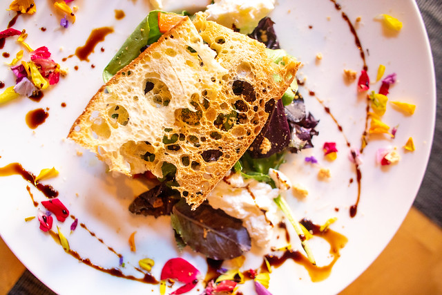
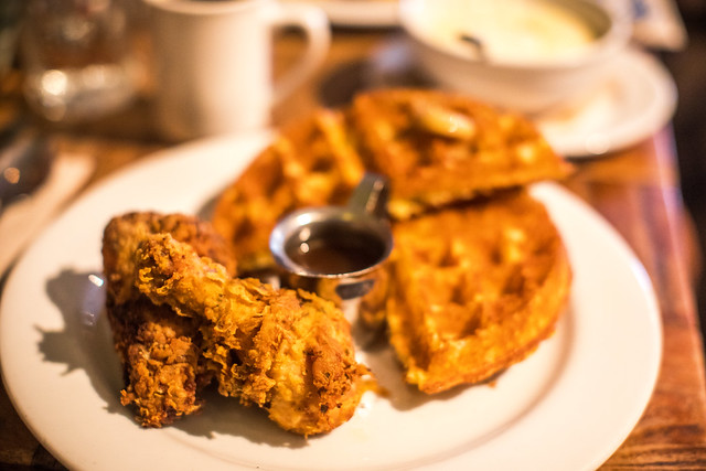
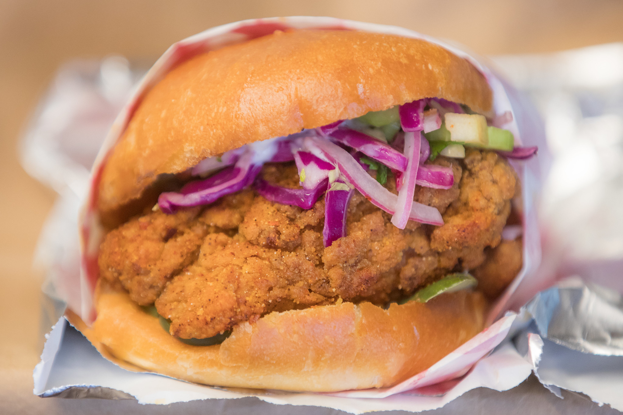
The Bird’s fried chicken sandwich offers a juicy, succulent piece of fried chicken complimented by a slightly sweet apple based slaw on a brioche bun.

New Fried Chicken Sandwich at Organic Coup
Organic Coup’s fried chicken sandwich offers a slightly larger piece of chicken with a tangy and spicy slaw with jalapeno on an equally tasty bun.

Downtown San Franciscans were treated to not one but two new fried chicken sandwiches this week in the heart of San Francisco’s Financial District. Two new restaurants, Organic Coup and The Bird are both located a mere 2 blocks off of Market Street. Organic Coup North of Market at 224 Kearny and The Bird South of Market located at 115 Montgomery.

The Bird is open Monday through Saturday from 11am to 10pm.

Organic Coup is open 11am to 3pm Monday through Friday for lunch.

Since who the cluck doesn’t like fried chicken sandwiches, I tried both this week and thought I’d write a few thoughts on each of these fine new chicken coops. My co-worker Sam Greene joined me (because birds of feather stick together) and I’ve added his thoughts on each section of this review.

Let the great San Francisco Cluck Off begin!

Organically Cocky at the Organic Coup
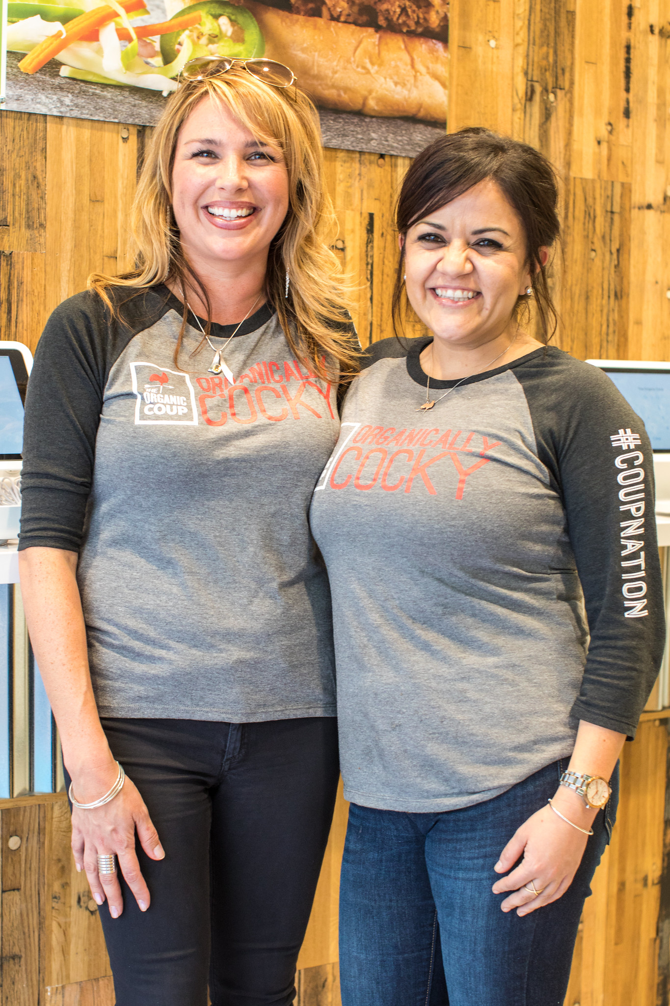
Organically Cocky at the Organic Coup.

The Bird, Fried Chx Sandwiches 200 Daily, #Cluck Yeah
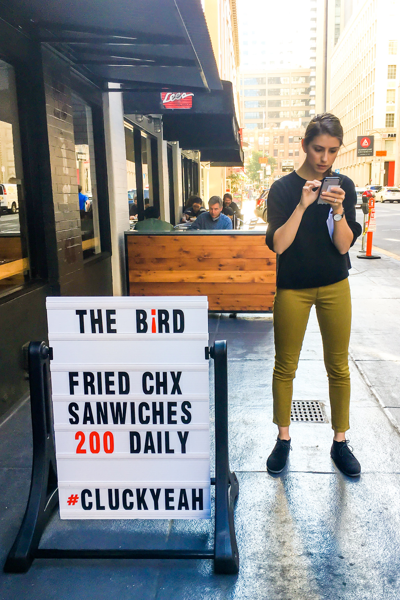
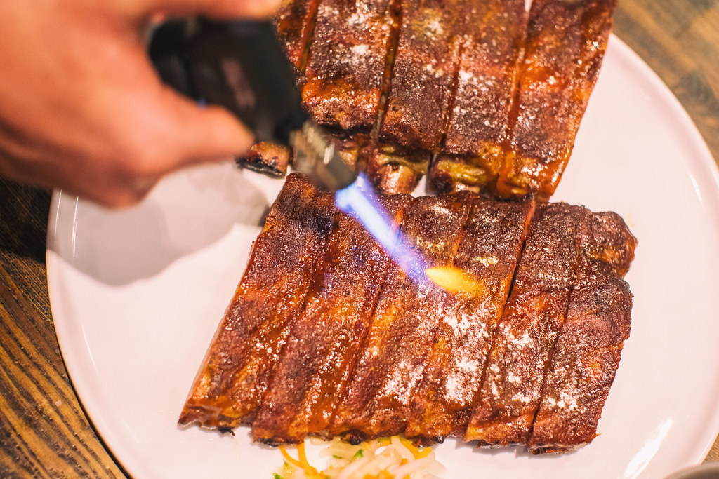
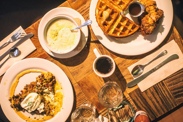
The Bird, Fried Chx Sandwiches, 200 Daily #CluckYeah.

Waiting for a new fried chicken sandwich at The Bird
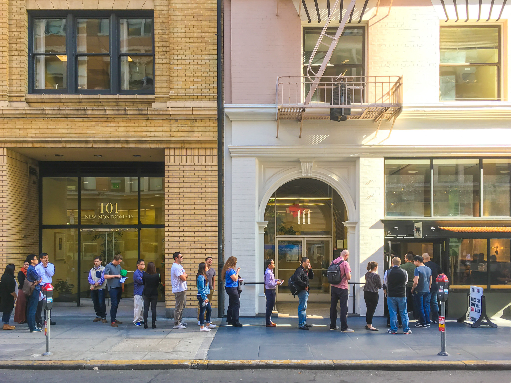
50 Deep in line at The Bird. Get there early and plan on a wait.

Ordering. (Winner: tie)

Although it’s probably not fair to compare the foot traffic at both of these restaurants on opening week, plan on spending a lot more time waiting for your chicken sandwich at The Bird than Organic Coup.

I arrived to a line already 50 deep at 11:10 am Friday at The Bird. The wait was approximately half an hour from start to finish. By contrast you get in and out of Organic Coup much faster. I went to Organic Coup on Wednesday and Thursday at 11:10am and there was no line. On Friday I went to Organic Coup after the Bird at around 11:45am and the wait still was only about 4 people for about 5 minutes.

Organic Coup had a very efficient ordering system. An order taker walks you through your order on an iPad. You make your designation side by side and then when you swipe your credit card the system automatically pulls your name and then uses your name to call you when your order is ready. The Bird offers a more formal across the counter cash register based system where they print out a receipt for you to sign. They do capture your name from your card as well though and use it to call your order.

Organic Coup has a sign up by the order taker that says no cash / no tipping. On their website they say that they are committed to paying their workers a livable wage and say that they “pay the highest wages in the industry.” With tax their sandwich is $11.

By contrast the Bird has you either write in or decline a tip on your credit card receipt when you sign. Their sandwich is cheaper at $9 with tax no tip.

I will write more on the whole tip no tip thing below, but I will say I liked the fact that Organic Coup doesn’t allow cash. Cash tends to slow things down and pretty much everybody has a credit or debit card these days.

I would clearly give the win to Organic Coup here based on the faster service, except for the fact that The Bird had a server come outside to the line and give everyone in the line a free sample of their clucking amazing ice cream sandwich, one of the best I’ve ever tried. Not only did they hand out free samples to the line, the guy handing out the samples came by afterwards to take everyone’s trash from the sample that was handed out. Such thoughtfulness and such an amazing treat made the line totally worth it. That was very smart. So the verdict here is a tie but both were pretty clucking great.

SAM’S TAKE:

Ordering (winner: Organic Coup)

I’m a big believer in the holistic evaluation process so it is hard for me to say which restaurant offers an absolutely better ordering system. I would start by saying the ordering systems are different. The Organic Coup offers a clucking-efficient iPad based self-service ordering system while The Bird offers the more traditional cash-transaction at the register system. I personally like the iPad self-service system much better for a few reasons. For starters, the pressure of having to field a barrage of questions at the counter is completely removed with the iPads. Additionally, what’s nice about ordering on the iPad is that it gives me a little more time to consider what options are available before making my selection. This way you don’t have to fumble over your words dictating your order to the cashier while you’re looking at the menu. Sure, it may be a bit awkward and anti-social to prefer the iPad system, but the reality is that ordering through the iPad is much easier and simpler for all parties involved and saves everybody a little bit of time.

However, since the fried chicken sandwich itself is a bit simpler at The Bird in that there is only a spicy and non-spicy option as opposed to an overwhelming assortment of sauces to add and choose from at the Organic Coup, I didn’t feel like the register-based system slowed down the ordering process significantly. Overall, I think the two are tied for the best ordering system. The Bird’s products don’t complicate ordering at the register, and Organic Coups iPad system nicely handles more complicated orders.

Cost (Winner: tie)

Sure the sandwich at Organic Coup is two clucks more, but the fact that there is no pressure to tip and apparently you can feel ok about not tipping because of the living wage thing, it sort of makes up for the extra cost. If you tip a buck at the Bird, the sandwich still comes in a dollar cheaper, but I’m sort of a fan of including gratuity in the price of a product which feels more like what Organic Coup is doing. It would be interesting to know how much each place pays their workers, but to me there’s not much difference between paying $11/no tip or $10 or $11 with manual tip.

Atmosphere (Winner: tie)

Both sandwich shops feel really nice although just a little crowded. Organic Coup feels a little more like a chain/corporate (and with multiple locations it sort of is) vs. the pop up feel of The Bird. The Bird (which is in the space that the old Melt use to use) has some seating which is nice if you want to eat your sandwich there. Seating is very limited, but at least they have some. I usually take my lunch to go though so seating didn’t matter to me. The Bird offers you a water cup which is nice. Organic Coup is more open and airy and light in my opinion — both are very nice and clean.

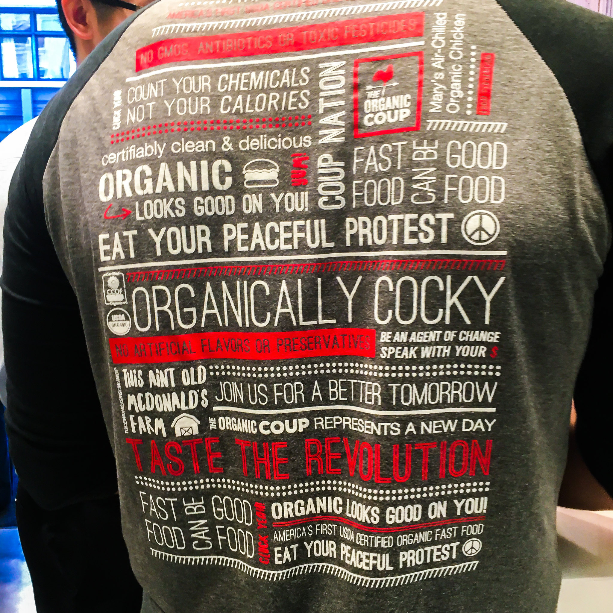
Both restaurants had people with menus outside greeting you. Both restaurants had friendly employees. Both restaurants were marketing with the San Francisco “Cluck Yeah” tag line sure to appeal to millennials everywhere. The Bird uses a hashtag based #CLUCKYEAH while Organic Coup chose to go with an exclamation point based CLUCK YEAH!

SAM’S TAKE:

Both shops were nice, clean and up to snuff. However, I feel like the Bird may have a slight edge in the overall atmosphere. Fist and foremost, the Bird has a larger space that is big enough to offer counters, seating, and complimentary water and bathrooms. Keep in mind though that around 11:00am when we went the place was hustling and bustling so it was difficult to find a place to stand and lean let alone sit and dine, so if you’re looking for a place to enjoy a leisurely meal I would look elsewhere. That being said, the fact that seating is available for less rushed and frenzied times during the day is a huge plus for me.

In contrast, the smaller, more cooped up space at the Organic Coup (no pun intended), did not feel large enough to adequately handle the 11:00am rush of lunch-goers who inevitably end up waiting on the sidewalk. Granted, the line at the The Bird wound around the block as well when we went — however, once all the hype dies down from the opening weeks for each location I think The Bird will be more attractive to a larger percentage of the lunch-going population since it does offer a place to sit. In light of all that, the smaller space offered by the Organic Coup is nice in that it sort of naturally moves folks along in and out of the building faster since nobody likes to stand around in claustrophobic, shoulder-to-shoulder, tight-knit spaces for long. If your intention is to grab your food and go, the Organic Coup is perfect. However, given the choice, I would rather have the option to sit and schmooze over a quick bite with a co-worker than feel rushed in and out of the place.

Secondly, the Bird felt like it actually had a personality. The interior design maintained what appeared to be the original look and architecture of the establishment that preceded The Bird. As a matter of personal preference, I thought it was nice that The Bird chose to maintain the integrity of style rather than give it a radical makeover to conform to the recognizable and modern look. There is an aura of traditional, classic fried chicken sandwich shop that emanates from the old-school single-letter-insert-menu hanging down from the ceiling. Overall The Bird presents itself as more of unique local, self-sufficient, one-of-a-kind joint while the Organic Coup is more of a modern and contemporary fast-food chain.

I have to hand this one to The Bird.

Nutrition (Winner: Organic Coup)

Organic Coup markets itself as America’s first USDA certified organic fast food restaurant. What’s more, they provide you with calorie nutritional information on their website. According to their website their Chicken Sandwich is 500 calories. For such a big fried sandwich I almost can not believe it is only 500 calories. They also offer a bowl, which is more like a fried chicken salad, with only 320 calories. For someone like me trying to maintain my sleek physique, those numbers are very reasonable and I appreciated that they shared them with me on their website.

The Bird does not provide nutritional information on their website. Based on the taste of their sandwich though (and the fact that it has mayo on it), I’d suspect it’s more than 500 calories.

SAM’S TAKE:

I have to agree with the Hawk here. I think it’s clucking-smart that the Organic Coup makes an effort to disclose nutritional facts on its website to its frequenters. In the age of the IoT, information is data and data is power to the consumer. As a consumer, I feel clucking-empowered by nutritional information in what I’m choosing to buy and eat, even though the information may not necessarily ultimately drive my decision. For example, I may find that the Organic Coup is less calories than The Bird, but I may still like the bird better since it has those incredible pickles. Merely the fact that Organic Coup openly shares with us the nutritional facts so transparently makes me more trusting of them as a restaurant regardless of whether or not their sandwich is any healthier, less caloric or has overall more nutritional value than The Birds. Props to Organic Coup on this one.

The Sandwich (Winner: The Bird, by a beak)

First off, I have to say I liked both sandwiches. I will definitely be back to both in the future.
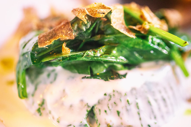
Organic Coup’s sandwich reminded me very much of one of my favorite East Bay secrets, the fried chicken sandwich at Bakesale Betty’s in Oakland only on a tasty bun instead of a roll. Organic Coup uses a vinegar based slaw with jalapenos in it just like Betty does. This is also the base for the slab of fried chicken that they serve with their bowl (which is more like a fried chicken slaw salad) and it is clucking delicious. You get a choice of four sauces for your bowl/wrap/sandwich. I got my sandwich with the vegan mustard vinaigrette sauce. The sauce was good but the irony that they were marketing my choice of sauce as “vegan” when I was eating a fried chicken sandwich was not lost on me. The spicy BBQ sauce seemed the most popular.

Organic Coup’s piece of friend chicken felt a little bit bigger to me than The Bird’s and hangs out of both sides of the sandwich.

As much as I enjoyed Organic Coup’s sandwich, The Bird edged it out here by a beak. Given the mayonnaise on the sandwich it definitely made it taste a bit richer. More than the mayonnaise though the chicken itself was more tender, flavorful and succulent. The Bird’s bird was a juicy, flavorful, delicious piece of mouthwatering bliss. The Bird’s sandwich had less slaw than Organic Coup’s but the slaw itself was a cabbage-onion-apple based slaw which gave it just the slight amount of sweetness that went perfectly with the spicy flavor. It also had Super Duper pickles on it which added a nice finishing touch.

The Bird had two versions of their signature sandwich, spicy and non-spicy. I of course opted for spicy and I’m glad I did.

SAM’S TAKE:

The Sandwich (The Bird, it was beak-and-beak the whole way through)

Both places offer un-clucking-believable fried chicken sandwiches. Both offer great, high-quality sandwiches sure to satisfy any afternoon deep-fried craving San Franciscan dropping by for quick bite to eat. The Bird differentiates itself from the Organic Coup in a few notable ways. While both offer delicious crunchy deep fried gustatory experiences, The Bird seems to let their birds simmer a bit longer in the pan allowing a thicker, deeper-fried coat to form. The deeper-fried coat made it all the more delicious and rich, though perhaps slightly less healthy. Additionally, the sandwich served at the Bird championed an artfully infused African Berber spice in the batter that was a flavorful and interesting homage to the origins of the fried chicken sandwich.

The coleslaw prepared at the Organic Coup offered more intense, spicier coleslaw than The Bird though. It beautifully complimented the spicy BBQ sauce served with the sandwich that I had chosen. Additionally, the Organic Coup offered a much larger chunk of chicken than The Bird which made me feel like I was getting better value for the two extra clucks I paid.

However, although Organic Coup made an eggs-ellent final product, the bird at the The Bird was slightly more succulent and juicy than at The Organic Coup. I’m pretty sure there was an element of marketing responsible for this perception though. Since I knew in advance that the Bird only made 200 sandwiches a day for the lunch crowd I think I was primed to believe they put more TLC, attention and energy into making each sandwich perfect than the Organic Coup. Upon deeper reflection, however, I do not think the modern fast-food nature of the Organic Coup takes away from the quality of their artfully though more industrially crafted sandwiches. It was just an observation I made when writing this review. I simply think I got a bit luckier at the Bird at the time I went in regards to the juiciness factor of the chicken. All in all, The Bird stood out to me as overall slightly tastier due to the tenderness of the meat and the deliciousness of the deep-fry recipe despite its shortcoming in size compared to the Organic Coup.

The Logo (Winner: The Bird)

Very hipster San Francisco looking fox with a chicken sandwich in his mouth, would also look good on a Bon Iver album cover.

I didn’t really get into the extras beyond the fried chicken sandwiches in this review, but it is also worth pointing out that The Bird sells beer which may be a plus for some while by contrast Organic Coup offers fresh squeezed lemonade. I have a general rule that I don’t consume alcohol before 6pm so I can’t imagine having a beer at lunch, but for more thirstier friends that might be a good option to know about.

The bottom line is both of these new fried chicken sandwiches are abso-clucking-lutely delicious. So the next time you and your cluck buddy get a craving for some fried chicken sandwich for lunch try one of these two hen houses. You won’t be disappointed and you might even get a free sample of some ice cream sandwich to go with it.

Cluck Yeah!
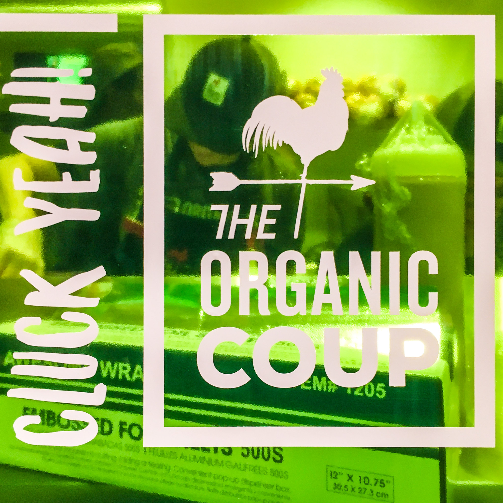
Cluck Yeah with an exclamation mark instead of the hashtag.

No Cash, No Tips
No Cash and No Tipping at the Organic Coup.

Organic Looks Good on You
Organic Looks Good on You at the Organic Coup.

Lemonade at the Bird
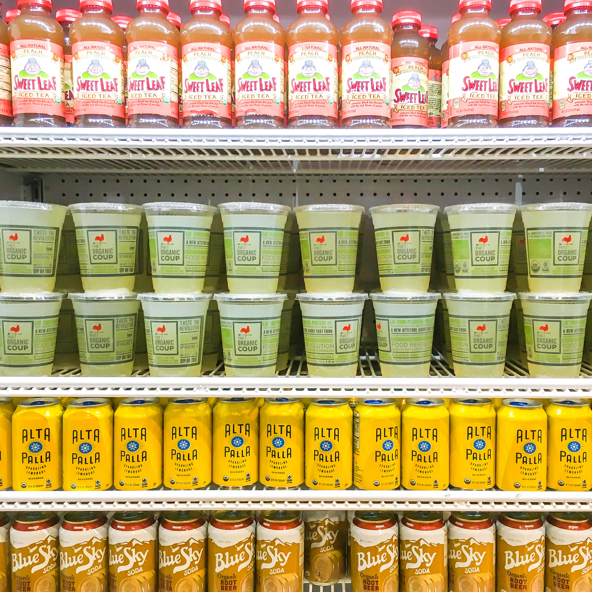
Fresh Squeezed Lemonade at Organic Coup.

The Organic Coup
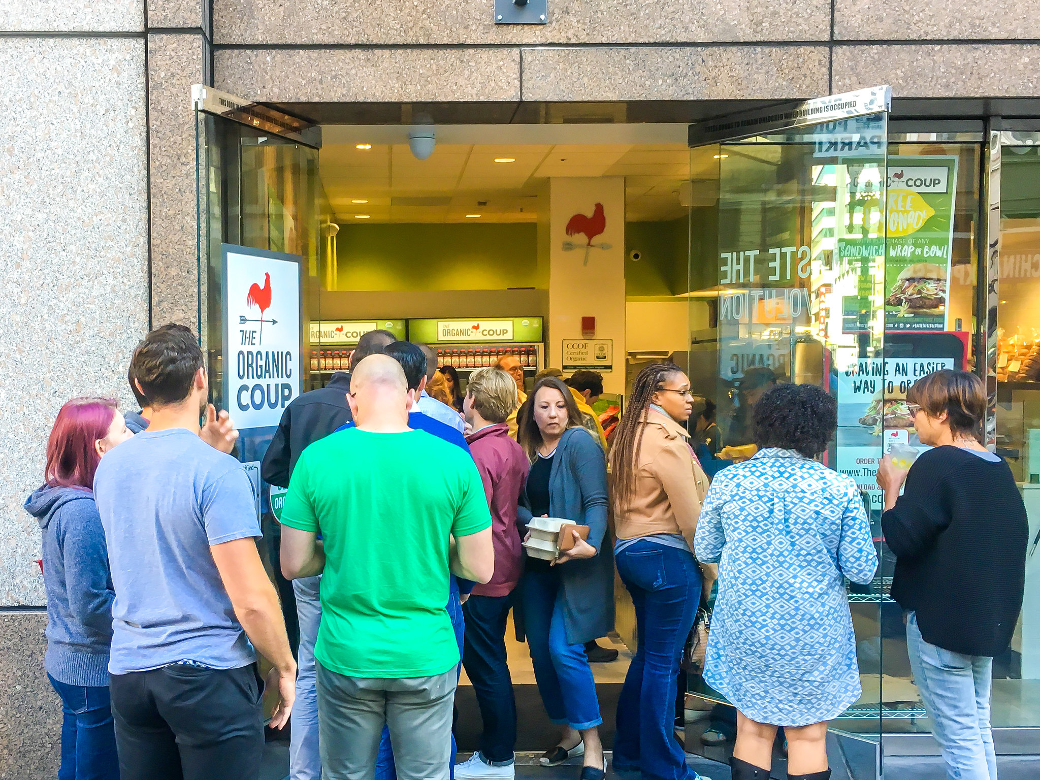
Standing outside Organic Coup on Kearny Street.

The Bird, Fried Chx, Beer
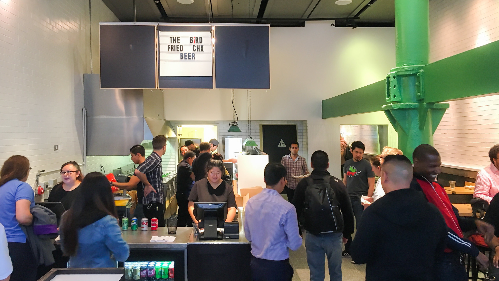
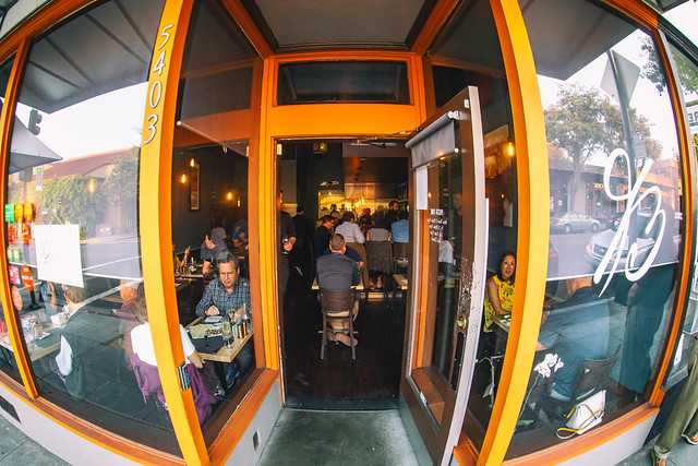
Interior shot of The Bird.

Flickr’s New Home Page is Fantastic!

New Flickr Feed on the Flickr Home Page

Even in the new Instagram, Facebook, Snapchatty world, Flickr still remains my favorite place to share photos. I have now posted over 120,000 photos to Flickr and it remains my primary online archive for my body of work. Even though you don’t hear about Flickr as much in the headlines these days, there is still a very robust community there who shares great work every single day. I usually post two batches of photos each day to Flickr, once in the morning and once in the evening.

The value proposition for Flickr is compelling. Both free and $49/year Pro accounts offer 1 terabyte of storage for your photos. One terabyte should be enough for almost every photographer out there today. Fortunately for me, I’ve been grandfathered into the old Flickr Pro account structure, which allows *unlimited* photo storage. I have already passed 1 terabyte at Flickr, but I am a very rare outlier. 99.9% of the photographers using Flickr today are nowhere close to this limit.

In addition to generous storage, Flickr also gives both Pro and free accounts a terrific iPhone/Android app and a beautiful web experience. Where Facebook and Instagram downsize and degrade your photos, Flickr allows you to host your full high resolution original JPGs. This also makes Flickr a great place as an additional layer of backup for published JPG images. Pro accounts also get ad free browsing and sharing (that’s why even free accounts don’t see advertisements on my photo pages) which makes the account worth the $49 a year alone. There are also some nice additional benefits to going Pro.

Recently Flickr made a very significant change to the web version of the site. Flickr.com, the main home page has been completely redesigned and in my opinion is 1000% better.

You may or may not have the new home page yet, but they are slowly rolling it out to everybody over time. If you haven’t been to flickr.com in a while I’d encourage you to check the new feed page out. You have to be logged in to see the new changes, but they make following your Flickr friend’s photos such a better experience.

Several new design elements have been brought into the new feed page.

1. There is now a three column layout. Photos are easy to browse and you can just scroll down the page looking at photos from your contacts.

Previews in the New Flickr Feed Look Awesome!

2. Preview. This is my favorite feature of the new feed. If you see a photo on a page that you want to see larger you just click on it. The photo instantly blows up big and beautiful in a very clean version on your screen. Even better, Flickr has incorporated keyboard commands to the large view of these previews, so if I like a photo and want to favorite it or comment on it I can just press the F or C key on my keyboard. If someone has uploaded multiple photos in a batch (like I usually do) I can also easily use the forward and backward arrow keys to go through a batch of photos, easily interacting with each image with my keyboard commands.

Once you are done looking and interacting with a batch of photos using preview, you can just hit the escape key and it takes you right back where you were to your place in feed. Very slick!

Previously if I wanted to go through my contacts’ photos I would have to go to the “People” menu item which was a very glitchy page that bounced around too much on page reloads. I still use the People tab because it allows me to filter between friends/contacts photos and sometimes I just have time to look at my friend’s images, but I’m finding that I’m spending the majority of my time following my contacts’ images through the new feed page. I also like that it includes entire batches of photos that I can click through if I want whereas the old People page only would show the last 1 or 5 images depending on how I set it.

In addition to providing a great new way to look at your contacts’ photos huge, the new page is very fluid and very fast. It feels like a big tech breakthrough vs. the old People page.

Please, Please, Please Make this Load More Button Go Away

My only complaint about the new page is that like other pages on Flickr it still makes you hit the dreaded “load more” button when you get to the bottom of the page. I wish that Flickr used true infinite scroll like Facebook does. It is such a better experience.

At first I did not like that you cannot fave/comment on batches of photos directly from the page, but after playing around with preview and seeing how well it worked and how fast it was, combined with awesome keyboard shortcut commands, I became a convert and now flickr.com has earned a coveted spot on my bookmarks bar. Hats off to the Flickr design and engineering team for such an awesome improvement to the site. 🙂

There is a help forum thread on the new Flickr feed where you can read more about the new Flickr feed and see what others think of it here.

You can follow my work on Flickr here. 🙂