Today Flickr announced a new preview version of their main photo page.
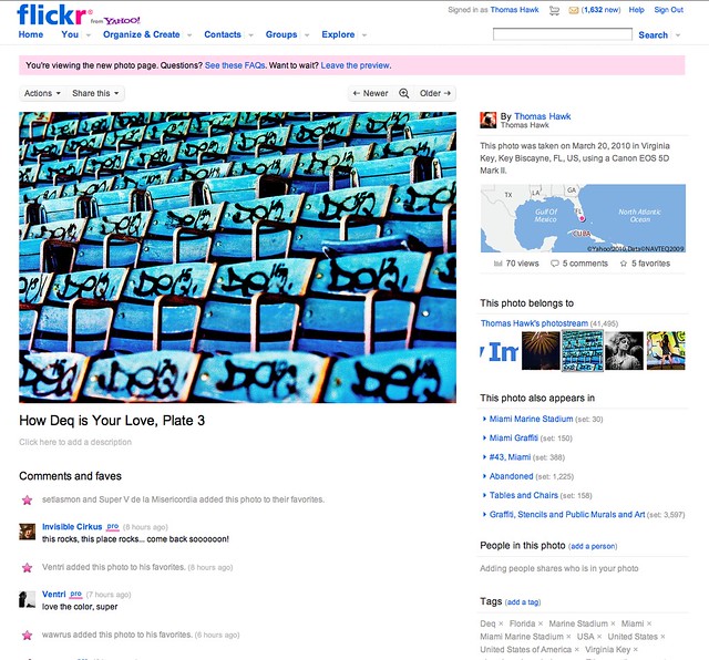
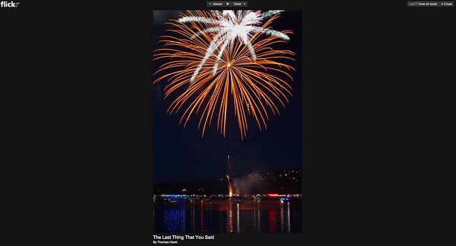
The most significant difference is that photos will now be shown at 640 pixels default on the Flickr page rather than 500 pixels. Flickr has also added a lightbox option where you can simply click on a photo to enlarge it to an even large size on a black background (you can also press the “f” key on your keyboard to toggle back and forth between lightbox view). It is interesting that they are using an old version of the Flickr logo (without the “from Yahoo” tag) in the Lightbox view. They’ve also significantly enhanced the geotags associated with photos, offering three different map views far away, closer, even closer as you move your mouse over the geotag thumbnail image.
Additionally Flickr has consolidated many of the view and functions associated with an image into “action menus” at the top of the page above the photo and integrated favorites into the comments section.
After playing around with the new page for about a half hour or so I have to say that I think I like it. It feels much cleaner, slicker and easier to navigate. I like the keyboard commands you can use to advance through a photostream. Some of the small differences will take some getting used to, but I think showing off photos bigger is *great.* I think I’d like to see the thumbnails in the sets link slightly bigger, but that’s a small complaint. Overall I think that this refresh of the photo page is a welcome improvement for the Flickr experience and am happy to see it.
There is a “gut reaction” thread where Flickr users are expressing their opinions on the new page design that you can check out here. Right now it feels like initial reaction is trending positive on the change over negative by a meaningful margin from the Flickr community.
What do you think? Do you like it? Hate it? Not care either way?
Update: TechCrunch has a review on the new redesign as well including comments from Flickr Head of Product Matthew Rothenberg here. Rothenberg is apparently saying that with the redesign pages should load �greater than 50% faster in almost all cases,� according to TechCrunch.
I like it! Especially the larger default images and the view on black.
My first impression is indifference. The new design feels less flickr-like in overall character, which is not a bad thing, I guess.
I’d prefer it the image title remained above the photo instead of moving it below.
Now that I have had a day to play with the page a bit I have discovered a few issues that bug me.
-I prefer the old way of displaying photo tags, one per line. It’s easier to read, easier to manage and easier top play the many tag-voting games on flickr.
– I noticed that the comments roll over to the next page after 30 (or so) rather than the old 100. I prefer more comments per page.
– The comments are interrupted by favorite notifications. This, in my opinion does not belong in the comments. It disrupts the flow of the comments and makes more difficult to follow the conversations that often sprout withing the comments.
I like it too. It is much cleaner and easier for non Flickr people to understand and navigate.
Biggest Gripes:
1) moving one-click actions to a sub-menu
2) Moving the photo title BENEATH the photo!?
3) Confused all over again between adding a description and a comment.
-danny
Oh, forgot to add:
4) “Tag jumble” harder to read than old “tag list.”
-d
I had been beta testing the new design for over a month. People kept complaining about not being able to see things with just 1 or 1.5 clicks. Like exif data and other very limited things that most people do not know about. They liked the old way of seeing tags and didn’t like things under actions or share this. It made no sense to me because I like the clean look and I love it and dig the bigger size. But they were the same people who didn’t know how to scroll using an iphone also.
Hi,
What do you think about the fact that now anyone can right click and download pics easily (that too a higher resolution one)?? the lightbox option has made ALL pics susceptible to download including hi-res version. All flickr did was add 1 line in the FAQ saying if you dont want your pics misused upload low res. what do they think about years of pictures loaded earlier in everyone’s account, only they know.
Actually, Thomas, the last time I looked the consensus in the Flickr help forum – you know, the place where the people who are actually going to get stuck with this thing are likely the be found – was against the new design, and it was fairly overwhelming, page after page of users saying how much they hated it and wanted the old design back. The only way one could find a majority leaning the other way would be to do as one of Flickr’s apologists tried to do, and count all absentions as votes in his column.
That anybody could take such an outrageous position seriously would have amazed me, had I been new to the Internet at the time, but we’re online and outrageousness is to be expected. We now have a critical mass of puff pieces written about this makeover, so I suppose that reality is now beside the point, but still, I was disappointed to see that you had become one of the people shilling for Flickr.
If you like the new design, that’s fine. Personally, I think that it’s absolutely hideous, but I’m happy to agree to disagree with you on that one. Leaving your readers with the idea that this was a popular change, though, was just wrong, and that’s where the shilling enters into the picture.
I am very disappointed with you, but I guess I shouldn’t be surprised. Flickr seems to have such a small and incestuous group of users at the core of its very large membership, that the “opposition” very often isn’t what it first appears to be, turning out to be just another group of insiders pretending to be something that it never was. Oh, well.
Oh, and Tom, please do give your users a chance to preview their posts in the future. “Absentions” should read “abstentions”, but by the time I noticed that I should have hit the t key with a little more force the first time, it was too late to do much about it.
Any system based on the assumption that human error (eg. typos) won’t or shouldn’t happen isn’t very well designed, because it’s based on an unreal assumption.