
[Note: This news was embargoed until 9:00 a.m. this morning, but TechCrunch broke the embargo.]
At 9 a.m. this morning, FriendFeed launched a new user interface at beta.friendfeed.com. The new beta site will run in parallel with the current version of FriendFeed at friendfeed.com at least for a while.
The biggest difference between the old version of FriendFeed and the new version is the introduction of live scrolling updates. I had early access to the new beta site over the weekend and spent some time playing around with it.
Here are my initial thoughts.
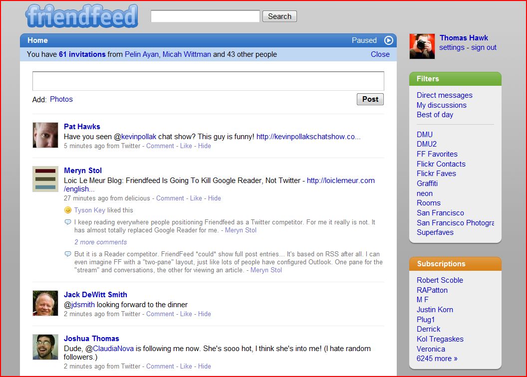
1. Live Updating. I tried playing around with this and have mixed feelings about it. Sometimes I really like it. It feels more intuitive and interactive. Other times it’s harder to put into words why I don’t feel like I like it, but the word that keeps popping into my head is seasickness. A lot of the problem here is that I’m following a ton of people (over 6,000) and so the user interface just scrolls too fast some of the time. Too fast for me to read on my main FriendFeed page. It feels chaotic and I can’t keep up. I found that late at night it is slower and more manageable but during prime time it was too fast.
Fortunately for me (and others) there is a pause button which allows you to turn this feature off and manually refresh the page like you did with the old version. Live updating works much better on my smaller lists. I’m sure there are some that will really digg this new feature though, especially since most people are not trying to follow over 6,000 like I am. I’m interested in hearing Robert Scoble’s observations about this feature as well as he follows even more people than I do. This new feature is turned on by default.
I suspect that most of the time I’ll have live updating turned on but that during especially busy times I’ll turn it off.
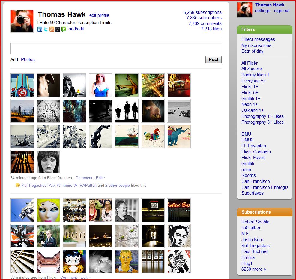
2. A new design and interface with much more emphasis on your avatar. I have to say I love the new UI. I think the new UI looks much cleaner — beautiful looking with easy on the eyes rounded corners and the what not. I’m assuming Kevin Fox deserves some of the kudos for this new design, but whoever worked on it, hats off to you.
I think one of the things that hurt the old version of FriendFeed was that it just felt too complicated and even a bit clunky. Even though I never thought it was too complicated for me, I heard that complaint from people a lot. All of the little service icons could be intimidating.
Now FriendFeed has dropped the service icons and focused much more on the individual user avatar. It feels a bit more like Twitter now in that regard. I actually like this and think that it will make FriendFeed much less intimidating to people. I also suspect that females with attractive avatars are likely to see a significant spike in followers on this new version. 😉
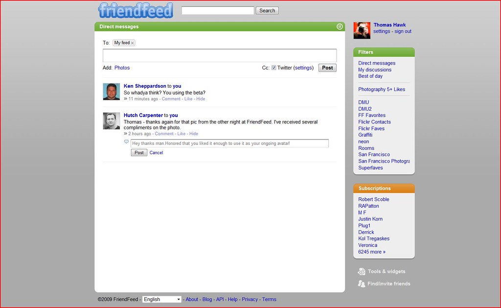
3. Direct messaging comes to FriendFeed. With this new user interface, FriendFeed has now introduced direct messaging. This small but super powerful new feature is much bigger than I think people will realize at first. I think FriendFeed direct messaging could eventually replace a lot of my email personally. Some of the people behind GMail are on the FriendFeed team so I expect good things from their direct messaging service. It’s nice how FriendFeed shows you a little number next to your Direct Mail menu, much nicer than “YOU’VE GOT MAIL!” But the real power of direct messaging in Friendfeed is that it really incorporates a whole new way to communicate via email. It’s far more collaborative with the live updating.
One of the things I hate about email is that once I send a message it’s gone. Frequently I’ll send an email and then realize I made a typo or misspoke or wish I could in some way edit it. With FriendFeed you can. You just go back into the message and change whatever you meant to say. Because all of the messages are grouped together it’s much easier to follow and track conversations directly than traditional email.
Direct messaging on FriendFeed almost feels more like a chat/mail hybrid than anything. I found that just using this new service for one day that it was one of the stickier things I’ve seen on FriendFeed. I’ve seen very little spam on FriendFeed so far and FriendFeed’s direct messaging feels a lot more fun than regular old email.
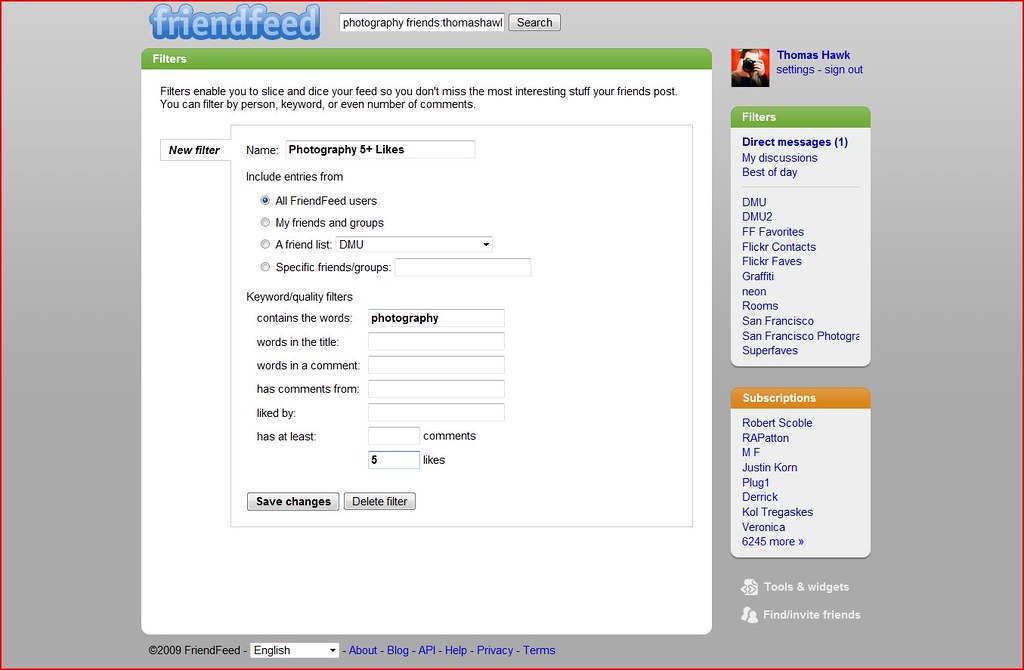
4. Filters. Filters rock. One of the most exciting ways to use FriendFeed is to filter interesting ways to view all of the vast repository of information and data it has become. One of my favorite filters is scanning FriendFeed for entries with the word “photography” in them with five likes or more. I’ve found some super interesting photographers and photography related stuff on the internet that way.
In the past I actually just made a bookmark for this and would go to the bookmark myself. It’s nice to have it built right into my main FriendFeed Interface. It will be interesting to see the FriendFeed community builid and share custom filters over time. I suspect that there are many hidden gems out there that we don’t even know about yet. But in the meantime, check out a few of these filters that I’ve already created for myself personally: all Flickr posts, all Zooomr posts, all posts on FriendFeed with 5 likes or more, all Flickr posts with 5 likes or more, posts mentioning the word neon with 1 like or more. These are just a few examples. The sky’s the limit here really. If you’ve got some great filters yourself please leave them in the comments.
5. Profiles. Although they are very rudimentary, FriendFeed has now added the ability for you to add a description to your profile page. I’ve been a big proponent of profiles coming to FriendFeed for a while. Initially I was a bit disappointed with the profile description because earlier yesterday in the beta it was limited to 50 characters. I set my original profile description as “I hate 50 character limit profiles.” But then after I direct messaged Bret Taylor, one of the FriendFeed Founders, about this, Bret extended the character limit and so now I’m able to fit the same tagline that I’m using on Twiter: “Quiet Observer of Modern Nihilism with Box that Captures Light.” Thanks to Bret and the team for giving us a little bit more room for our profile descriptions.
I do think it would be interesting to see FriendFeed add a city or zipcode field in the profile info as well that could then be used to create a list of suggested users in your geographic area.
Overall I’m very happy with the new FriendFeed. I think it represents a simpler more elegantly designed user interface and a huge step forward for the service and for the company. I think this new interface will give FriendFeed much more mainstream appeal and really shows that FriendFeed is the clear leader in the microblogging and lifestreaming space right now.
If you would like to follow me on the new FriendFeed beta you can do that here.
Update, Other blogs and news sites on FriendFeeds Redesign:
1. Official FriendFeed blog post on the new redesign here.
2. Robert Scoble: Tips for Real Time Web working on new friendfeed.
3. Charles Hudson: The New FriendFeed UI – More About Content, Less About Sources
4. Mashable: The New FriendFeed Looks A Lot Like Twitter
5. TechCrunch: New FriendFeed: Simpler, Faster, Better (Maybe Too Fast)
6. CNET: FriendFeed’s redesign makes entire site real-time
7. Venturebeat: FriendFeed�s redesign combines publishing and IM better than Facebook or Twitter
8. The Inquisitor: New FriendFeed Beta: What�s Different
9. Hutch Carpenter: FriendFeed�s New Beta: Taking Realtime Aim at Facebook
10. Financial Times: Real-time web is for real on FriendFeed
11. Louis Gray: FriendFeed Reloads With Real-Time At Its Core
Update #2: Significant conversations about the new FriendFeed beta happening on FriendFeed
1. Bret Taylor: A new design for FriendFeed.
2. RAPatton: you can make your imaginary friends visible to others on FF now; if I only could do that as a child.
3. Jeremiah Owyang: What’s the difference between Friendfeed and Facebook? List them out below
4. Steve Rubel: Wondering if the new Friendfeed update has gone too far. Is it too fast for y’all? It’s almost like having one cup of coffee too many!
5. Susan Beebe: FriendFeed new UI is amazing! So glad I have a fresh POT of coffee here on my desk! wooo hoooo! 🙂
6. Steve Rubel: Friendfeed now tells you how often someone posts too if you are not subscribed to him/her.
7. Robert Scoble: I love it. Everyone is complaining that friendfeed is going too fast. Welcome to my world! Now, learn to use lists!
8. Mashable: The New FriendFeed Looks A Lot Like Twitter
9. Alex Scoble: Is it just me or does friendfeed look a lot more like Twitter now?
10. Shey: Being subbed to 950+ people and dozens of rooms finally comes back to bite me
11. AJ Batac: Cleaner FriendFeed (New Beta) – 04/06/09 | userstyles.org
12. Shey: Will the new FF beta increase interaction? Or will it die down with the buzz?
14. MG Siegler: i, for one, freaking love the new FF live speed. why slow down information? speed up your intake.
15. Bwana: Filters are awesome. Will be using them often.
16. Robert Scoble: The ones who complain the most about friendfeed beta are the ones who follow the most. Me? I just ride the wave and use the features. 🙂
Update #3: The new FriendFeed User Interface will be discussed on the Gillmor Gang this afternoon at 4pm.
Update #4: Robert Scoble has part one of four a video series of the FriendFeed new beta briefing here.
I haven’t really had a chance to explore the beta FriendFeed yet, but so far I like what I see, and it appears that the new firehose comes with tools that help you manage the firehose itself.
Thanks for all the fantastic information about FriendFeed! I joined today. It looks like a really neat platform.